You know that feeling when the afternoon sun hits your room at exactly 4 PM, turning the dust motes into floating gold glitter? For a second, everything feels romantic. But then your gaze drops, and the illusion shatters. You're staring at the same beige rental carpet, the cold grey laminate, or the generic wood floor that looks like it was designed by a committee of people who hate joy. It’s the visual equivalent of white noise—functional, present, but utterly devoid of soul.
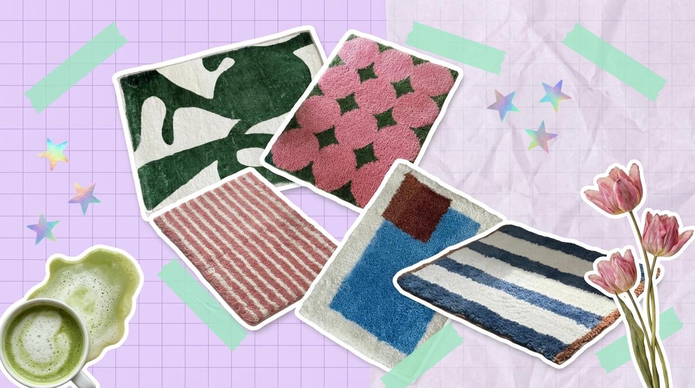
The floor is technically the largest piece of furniture in your room, yet it’s often the last thing we think about styling. We obsess over gallery walls and thrifted lamps, leaving our feet to navigate a landscape of boredom. The Danish Pastel aesthetic isn't just about painting everything mint green; it's a rebellion against this very greige-ification of our lives. It’s about Dopamine Decor—using color, texture, and organic shapes to hack your brain into feeling happier the moment you walk through the door.
Contents

The Matisse Effect: Organic Shapes & Sage Green
There is a specific kind of rigidity that comes with modern housing. Square rooms, rectangular windows, straight floorboards. It’s all very... Euclidian. The quickest way to soften a space that feels too "boxy" isn't to add more boxes, but to introduce the fluidity of nature. We aren't talking about dragging a potted fern into the corner and hoping it survives; we're talking about bringing the forms of nature onto your floor.
This approach draws heavily from the cut-out art of Henri Matisse—simplistic, organic, and intentionally imperfect. By placing a rug that refuses to follow straight lines, you create a visual "glitch" in the matrix of your room. It forces the eye to slow down and trace a curve rather than sliding quickly along a straight edge. This is the essence of the Danish Pastel movement: it's not just about the color; it's about the softness of the silhouette.

The Light Catcher Moment: This rug does something fascinating with natural light. The cream sections are tufted with a slightly higher reflectivity than the deep sage green parts. When the morning sun hits it from the east window, the cream wool seems to glow, reflecting that warmth back into the room, while the green shapes absorb the light, creating a deep, velvety matte finish. It’s not just a flat pattern; it becomes a topographic map of light and shadow. The organic green shapes look less like a printed design and more like shadows of leaves cast by a giant tree outside—bringing the outdoors in without the pollen count.

3D Florals: When Texture Becomes a Love Language
In the digital age, our eyes are exhausted from looking at flat screens. Phone screens, laptop screens, TV screens—everything is smooth, cold glass. This creates a subconscious hunger for what designers call "tactile variability." We crave things that aren't just visually distinct, but physically complex. A rug shouldn't just be a picture on the floor; it should be a landscape for your feet.
The resurgence of the "Soft Girl" aesthetic is deeply rooted in this need for comfort. It’s not about being childish; it’s about creating a sanctuary that actively protects you from the hardness of the outside world. When you incorporate a rug with high-pile, 3D tufting, you are adding a layer of architectural softness. It creates a physical boundary that says: "The stress stops here."

Tactile Synesthesia: This isn't a rug you just walk on; it's a rug you want to pet. The pink floral sections are tufted in dense, cloud-like clusters that rise significantly higher than the green geometric base. When you step on it barefoot, your toes sink into the pink "blooms" while the green parts offer a firmer resistance. It feels like walking across a manicured lawn dotted with moss cushions. There is a distinct "bounciness" to the microfiber pile—it doesn't flatten immediately under your weight but springs back, offering a tiny, silent greeting to your soles every morning. It’s the physical sensation of spring, permanently installed by your bedside.
The "Squiggle" Trend: Breaking the Grid
If you've scrolled through Pinterest lately, you've seen the "Squiggle." Wavy mirrors, curvy candles, and undulating rug patterns. Why the obsession? Because the squiggle is the visual embodiment of "play." It refuses to take itself too seriously. In a rental apartment where you might not be able to paint the walls or change the fixtures, a wavy rug acts as a declaration of personality.
This design choice is about disrupting the monotony of the straight line. Most furniture legs are straight. Door frames are straight. Planks are straight. A wavy rug interrupts this endless grid, injecting a sense of movement and flow. It directs the eye to travel across the room in a meandering, relaxed pace rather than a rush.

The Cinematic Still: Picture a lazy Sunday morning. You’re sitting on the floor—because for some reason, the floor is always more comfortable than the sofa on Sundays—leaning against your bed frame. The pink wavy rug is beneath you, holding a stack of magazines and a half-eaten croissant. The irregular stripes look like hand-drawn lines from a sketchbook, adding an artistic, unfinished quality to the scene. It feels like a frame from a coming-of-age indie movie where the protagonist is figuring out their life, but the aesthetic is already 10/10. It’s messy, it’s cute, and it makes the simple act of reading a magazine feel like an event.
Color Therapy: The Blue & Brown Power Couple
For a long time, mixing blue and brown was considered a fashion faux pas. But in the world of Danish Pastel and modern Nordic design, this combination is currently the main character. Why? Because it balances two opposing psychological needs: the need for calm (Blue) and the need for grounding (Brown).
This is what we call the "Unexpected Red Theory" cousin—using a warm, earthy tone to anchor a cool, airy pastel. If the rug were just blue and white, it might feel too "nautical" or "bathroom-y." The addition of the burnt chocolate brown block disrupts that expectation. It adds a layer of sophistication and warmth that makes the piece feel curated rather than generic. It turns a simple color-block pattern into a piece of modern art for your floor.

Color Therapy in Action: This rug acts as an emotional regulator for your space. The sky blue section offers a visual "exhale"—it’s the color of open space, clarity, and fresh air. It visually expands the floor area. The brown square, however, provides the "inhale"—it’s the color of soil, wood, and coffee. It grounds the floating blue, preventing the room from feeling too flighty or cold. When you place this under a light wood desk or beside a white bed frame, you are creating a micro-environment that says: "Be calm, but stay rooted." It’s the perfect palette for a study nook where you need focus without anxiety.

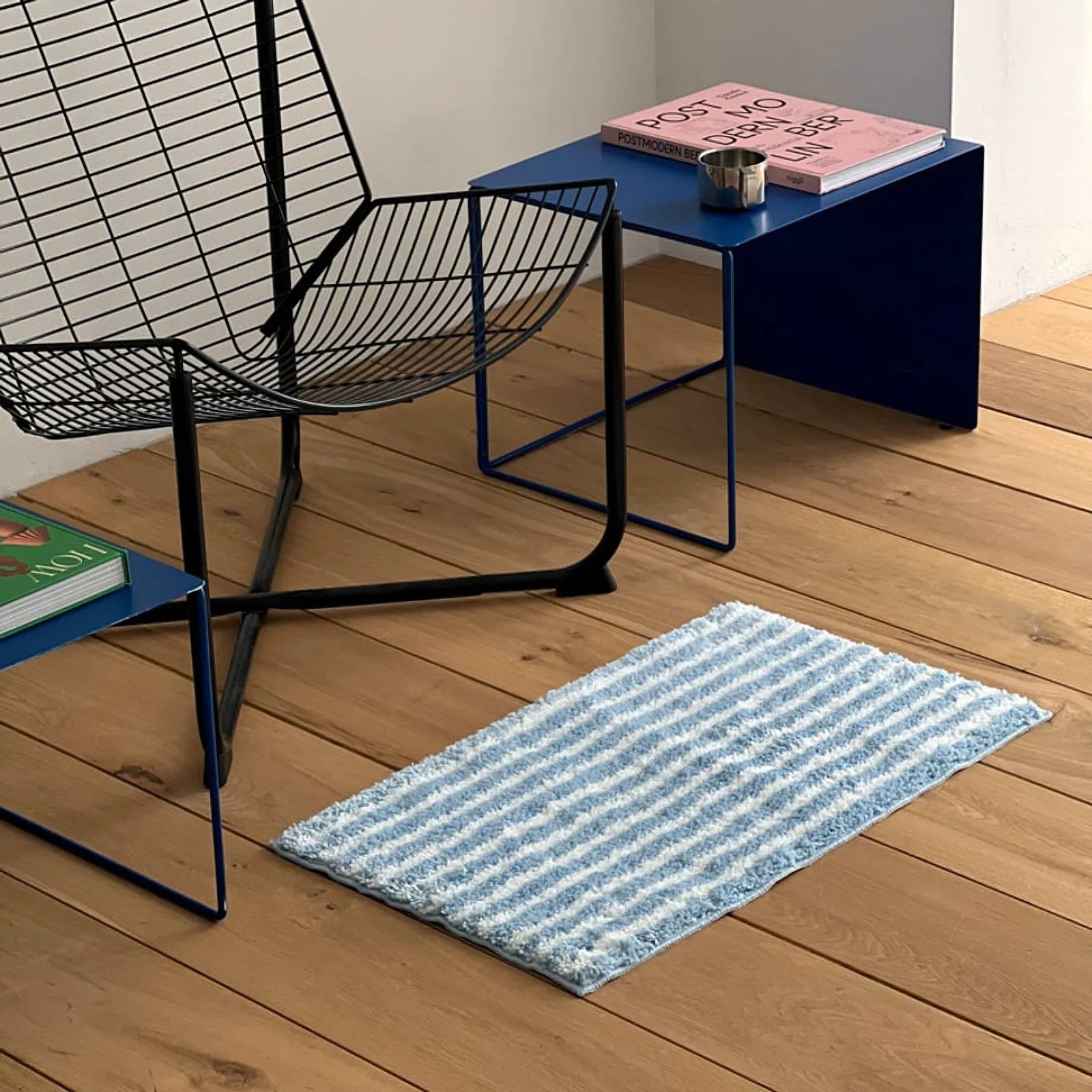
The Grown-Up Stripe: Order with a Twist
Sometimes, you want the fun of Danish Pastel without the chaos of squiggles or flowers. You want structure, but not stiffness. This is where the reimagined stripe comes in. It’s the "Preppy" aesthetic meeting the "Cozy" aesthetic in the middle. It reminds us of vintage beach towels, university dorms from the 90s, and classic pajama sets—things that signal comfort and familiarity.
But the devil, as always, is in the details. A standard blue and white stripe is safe. A blue and white stripe with a rust-brown border? That’s design. That tiny edge detail changes everything. It frames the rug, turning it from a piece of fabric into a defined zone. It creates a "rug within a room," establishing a clear boundary for whatever activity happens on top of it.

Memory Trigger: There is something inherently nostalgic about this deep denim blue paired with crisp white. It might trigger a memory of a summer cabin, a favorite oversized sweater, or the upholstery in a cool vintage car. The texture adds to this sense of history—the shaggy pile isn't perfectly uniform; it has a bit of a tussled, lived-in look right out of the package. It smells like "home" before you've even lived there. Placing this in a hallway or entryway acts as a palate cleanser; it’s orderly enough to calm the mind when you walk in, but the texture and color pop let you know you’ve entered a space where people actually live, not just exist.

The Final Layer: How to Style It
The beauty of these Danish Pastel rugs lies in their ability to do the heavy lifting for you. You don't need to repaint your walls or buy a new sofa to change the vibe of your room. The floor is your foundation. By changing the foundation, you change how everything else sits in the space.
Start small. Choose a corner—your "Sanctuary Corner." Maybe it’s the awkward space between the bed and the wall, or the spot under your desk where your feet usually freeze. Drop one of these rugs there. Add a source of warm light (a small lamp or a candle). Suddenly, that dead space becomes a destination. It becomes a place you want to be. And that is the true power of dopamine decor: it reminds you that your home is yours to enjoy, one square foot at a time.
Share:
Wabi-Sabi Vases: How to Style the 'Perfectly Imperfect' Look
Why Sage Green Bedding is the Ultimate Chill Vibe for 2025