It starts with the silence. You know the kind—the deafening silence of a blank, white rental wall staring back at you at 2 AM. It feels sterile, like a waiting room, completely devoid of the chaotic, colorful, messy energy that actually makes up your life. You scroll through Pinterest, seeing rooms that look like exploded diaries—layers of photos, torn tickets, art prints, and neon lights overlapping in a way that feels effortless yet perfectly curated. That isn't just decoration; it's an externalization of the soul. It's the "Indie" aesthetic: a rejection of the minimalist showroom in favor of a space that breathes, remembers, and feels deeply, unapologetically you.
Contents

The Philosophy of the "Wall Dump"
Why do we crave the collage? Because in a digital world where everything is ephemeral, we have a desperate need to make our identity tangible. The "Indie" wall is essentially a physical mood board—a scrapbook that exploded onto your vertical surfaces. It's not about symmetry; it's about narrative.
The core of this aesthetic is the concept of "Controlled Chaos." It acknowledges that life isn't a neat grid. It's a collection of jagged edges, blurry memories, and saturated moments. By layering prints, overlapping corners, and mixing textures, you are telling a story that linear decoration simply cannot handle. It transforms the intimidating vastness of a white wall into a cozy, enclosed sanctuary that holds you. It turns a rented room into a home, not by painting the walls, but by covering them with your own skin.
Curating Your Vibe: The Aesthetics
The beauty of the indie wall collage kit is that "Indie" is an umbrella term. It shelters the grunge kids, the soft girls, the dreamers, and the thinkers. The key is to find the frequency that your brain vibrates at.
The Digital Dreamscape (Y2K & Aura)
Imagine the hum of a computer server room mixed with the spiritual glow of a crystal shop. This aesthetic is for those who live at the intersection of nostalgia and the future.
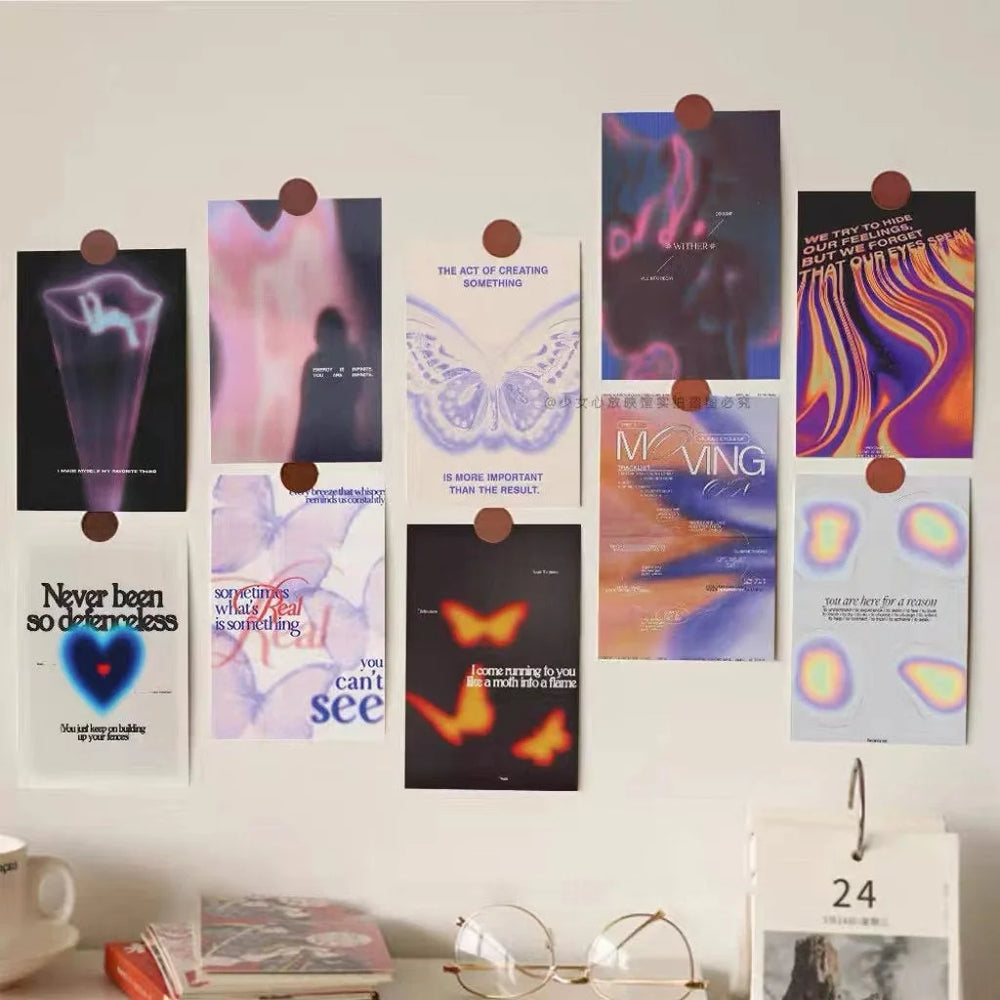
The Grainy Gradient Aura Wall Collage Kit operates on the principle of "Light Catching." When you pin these cards up, you aren't just adding color; you are adding a light source. The grainy texture mimics the low-fidelity noise of early digital cameras—a visual ASMR that feels fuzzy and warm. The saturated gradients of deep purples, neon pinks, and electric blues don't just sit on the paper; they seem to vibrate. Under the influence of LED strip lights (a non-negotiable accessory here), the matte cardstock absorbs the glow, turning each print into a portal. It creates a space that feels like it exists inside the internet, safe and suspended in time.
The Cinematic Main Character (Moody & Grunge)
If the Aura kit is the internet, this vibe is the cinema. It's for the introspective souls who narrate their own lives in the third person. The aesthetic here draws heavily from the "Indie Sleaze" revival and 90s grunge, focusing on the beauty of the blur.

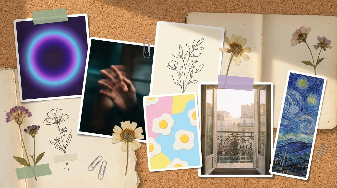
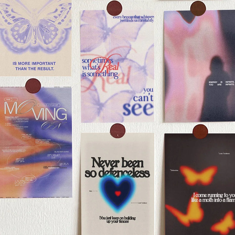
The Moody Cinematic Wall Collage Kit works like a series of freeze-frames from a movie about your life. Look closely at the print of the blurred hand or the out-of-focus streetlights. These aren't high-definition stock photos; they capture the feeling of a fleeting moment—the split second before a kiss, the drive home at 3 AM, the song that makes you cry. The dark, rich blacks and deep reds anchor the room, creating a "cave-like" safety. It’s visual poetry. When you arrange these overlapping on your wall, you aren't decorating; you are storyboarding. You are validating your own complex emotions by surrounding yourself with art that understands the beauty of being a little bit sad and a little bit mysterious.
The Dopamine Hit (Danish Pastel)
On the complete opposite end of the spectrum lies the "Dopamine Decor" movement. This is for the days when the world feels too gray, and you need your walls to scream joy. Drawing from the Danish Pastel trend, this style uses soft edges and unapologetic cheerfulness to hack your brain chemistry.


Combine the Playful Doodle Kit with the Vibrant Danish Pastel Kit, and you have a recipe for instant happiness. The "Color Therapy" here is real. The soft lilacs, butter yellows, and mint greens aren't just cute; they signal safety and spring to our primate brains. The naive, hand-drawn quality of the doodles—a simple flower, a wonky smiley face—removes the pressure of perfection. It invites you to be playful. When you wake up and the first thing you see is a poster that says "Oh! Happy Day" in a groovy 70s font, it’s hard to stay in a slump. These prints don't take themselves too seriously, and neither should you.
The Intellectual's Corner (Academia)
Perhaps your version of "Indie" is less about loud colors and more about quiet contemplation. This is where the Light and Dark Academia aesthetics come into play—a celebration of learning, history, and the romance of the analog world.

The Curated Artist Series Wall Collage Kit transforms your wall into a private wing of the Louvre. But it's not just about putting pictures on a wall; it's about the "Craftsmanship Narrative." When you tape a print of a Van Gogh sky or a Degas dancer next to your study schedule, you are borrowing their genius. You are creating an environment where creativity feels possible because you are surrounded by the masters. The matte finish of the cardstock is crucial here—it needs to feel like paper, like a sketchpad, not like a glossy photo. It invites touch and close inspection.
Pair this with the Vintage Parisian Film Aesthetic Kit for a "Sensory Immersion." These images act as memory triggers, even for memories you haven't made yet. A photo of a sun-drenched cafe table or a quiet street corner in Montmartre evokes the smell of espresso and old stone. It transports you out of your dorm room and into a European daydream. It’s sophisticated escapism at its finest.


And for those who find peace in absolute reduction, there is the Minimalist Monochrome Wall Collage Kit. Sometimes, the most "Indie" thing you can do is refuse the noise. This kit uses the philosophy of "Negative Space." In a cluttered life, these stark black and white images—a simple coffee cup, a line of text—act as visual palate cleansers. They don't demand your attention; they give it back to you. Placing these above a desk creates a zone of focus, a visual silence that allows you to hear your own thoughts.

The Art of Arrangement: Chaos Theory
So, you have your kits. How do you put them up without it looking like a crime scene investigation board? The secret is to embrace the overlap.
Don't measure. Throw away the ruler. The Indie aesthetic thrives on organic growth. Start with a central piece—maybe a large quote or a bold color from the Grainy Gradient kit—and work outwards. Let the corners touch. Let a smaller Playful Doodle card sit on top of a larger Moody Cinematic print. This layering creates depth and texture, making the wall feel like a living, breathing entity rather than a static display.
Think of your wall as a conversation. The Curated Journal prints whisper to the Artist Series prints; the Danish Pastel shapes laugh with the Indie gradients. There are no rules, only vibes. And the best part? It's all temporary. Use painter's tape or poster putty. Change it when your mood changes. Let your wall evolve as you do.
Your room is the only place in the world where you have total control. Don't let it be boring. Make it loud, make it messy, make it yours.

Share:
Retro Time: Vintage Table Clocks to Complete Your Bedside Table
Stop Losing Your Earrings: 6 Jewelry Organizers You'll Obsess Over