
The Psychology of Calming Bedroom Colors
Calm isn't one color, it's a temperature. We walk a cool-to-warm line through real bedding sets, from quiet blueberry linen to shoulder-dropping sage to warm blush and dusty lavender.

At about six in the evening, when the daylight in our studio goes flat and gold, one sage green bedding set we'd photographed all morning suddenly looked like a different fabric, deeper, softer, like the room had quietly turned its volume down. We'd seen plenty of swatches photograph well at noon and then go cold and lonely at dusk, but this one did the opposite, and that single low-light moment is what sent us down a rabbit hole about calming bedroom colors, the ones that actually keep getting gentler as the night comes on instead of louder. The short version of what we found: calm isn't one hue. It runs along a temperature, from cool-calm to warm-calm, and where you land on that line decides how your room makes you feel at the exact hour you're trying to fall asleep.
So this isn't a list of "relaxing colors" ranked one to ten. It's a walk along that temperature line, with the colors we've actually lived with on real beds under real light, arranged by the feeling each one leaves in the room rather than by how it scores on a chart. The aim was never a trendy bedroom. It was a space that feels like you, one that exhales a little the moment you walk in.
Contents
- Calm Is A Temperature, Not A Single Color
- Reading The Cool End: Soft Blue That Stays Warm Enough
- The Restful Middle: Sage Green, Where Your Shoulders Drop
- Crossing Into Neutral: Washed White That Isn't Cold
- The Warm End: Blush And Dusty Lavender Without The Sugar
- Where On The Line Do You Belong?
- A Few Questions We Hear A Lot
- Start With The Color You'd Want To Wake Up Beside
Calm Is A Temperature, Not A Single Color
Color psychology gets flattened into "blue is calm, red is energizing," and that's not wrong so much as half the story. What actually settles a nervous system at bedtime is low saturation and soft contrast, not one specific hue. A muted, desaturated shade gives your eyes less to resolve, which is part of why a sage or a warm off-white can feel like a held breath while a bright primary feels like a phone notification. Sleep researchers point the same direction, that low-stimulation, low-contrast surroundings help the body shift toward rest (the Sleep Foundation covers the broader bedroom-environment side of this well).
But once you accept that several hues can be calm, you need a better way to choose between them, and the most useful one we've found is temperature. Picture a line. At the cool end sits soft blue, recessive and a little aloof. In the restful middle sits green, the most neutral thing your eye processes. Then it warms through washed white into blush and dusty lavender at the far warm end. Every color on that line can read calm, but cool-calm feels like quiet solitude while warm-calm feels like being held, and that emotional difference matters more than any single "most relaxing color" ranking. The other half of the story is texture: a bedding set is the largest soft field of color you actually lie down inside, and a crinkled or slubby surface pulls a color's temperature toward warm by scattering light instead of bouncing it back at you. So as we walk the line, watch how each fabric nudges its color along it.

Reading The Cool End: Soft Blue That Stays Warm Enough
Blue is the cliché answer to "what's the most relaxing bedroom color," and it earns the reputation, your eye reads it as cool and recessive, which can genuinely slow you down. But the cool end of the line is also where colors get into trouble after dark. A clean, saturated blue is the shade we've most often watched go chilly and a little lonely at dusk, draining toward grey at the very hour you want warmth. The way to keep blue's calm without its coldness is to nudge it inward along the line, muted, warmed by a cream base, and softened by a tactile weave.
That's why we reach for a blueberry tone carried in linen rather than a flat cotton. The Textured Blueberry Embroidered Linen Bedding Set grounds a soft, dusty blue on a cream-colored linen base, with delicate embroidery and a fine dark piping. The cream keeps the blue from ever tipping fully cool, and linen's slubby, irregular weave scatters light so the color holds its warmth even as the room dims. When we left this one made up overnight and walked back in at dusk, it had deepened rather than gone grey, which is exactly the low-light behavior the cool end usually fails. In your room, this is the blue for someone who likes the feeling of quiet solitude but doesn't want to wake up cold.
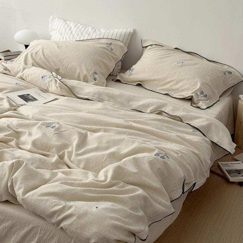

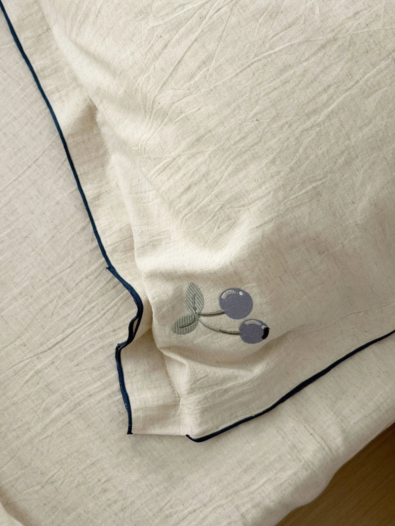
So if you've always reached for blue but found your room ended up feeling cooler than cozy, the fix isn't a different color, it's the same blue pulled a step warmer along the line. A blueberry on linen gives you the recessive quiet of the cool end without leaving the room feeling like a hotel hallway after lights-out.

The Restful Middle: Sage Green, Where Your Shoulders Drop
Move toward the center of the line and you land on green, which is as close to thermally neutral as a calming color gets, neither hot nor cold. Green sits at the restful middle of what the eye processes, and a desaturated sage reads almost like a deep exhale. It's the closest a color comes to the feeling of standing outside under trees, which is probably why it disarms people so fast. If the cool end is solitude, the middle is simply ease, the color that asks the least of you.
The set that lives most happily here is the Soft Crinkled Geometric Washed Cotton Bedding Set in sage, the one from that six-o'clock studio moment. The reason it stays so squarely in the restful middle is the crinkle: that washed, puckered surface breaks the green into a thousand tiny soft shadows, so it never goes flat or sharp. We styled it on a low bed with nothing but an open book on top, and the room genuinely felt a few degrees quieter. The faint geometric pattern is there, but it whispers, giving your eye a gentle place to rest without becoming a thing to look at. In your room, this is the color that does its work the second you stop noticing it.
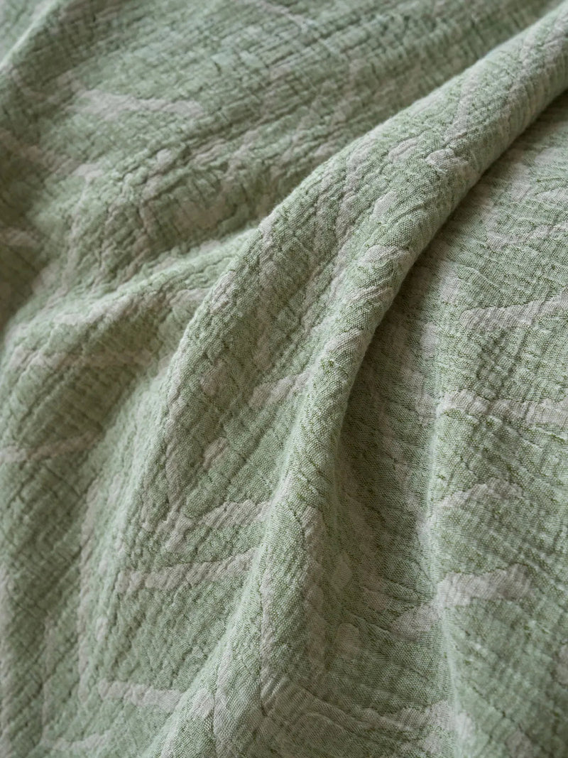
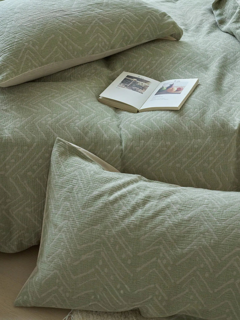
So if the loud, cold-toned room you have now feels more like a place to charge your phone than a place to rest, the restful middle of the line is the lowest-risk place to land. A grounded green pairs with almost any wood tone and asks nothing of the rest of your decor, which is exactly why it's the safest first move toward a calmer bedroom.
Crossing Into Neutral: Washed White That Isn't Cold
Keep walking and the line crosses through neutral before it warms up, and that's where white belongs. White gets a bad rap as sterile, but that's stark white's fault, not white's. A washed, slightly creamy white sits just on the warm side of neutral and is one of the most restful colors there is, because it does the calming work of a true neutral while still feeling soft and lived-in rather than clinical. The trick is contrast control: a pure-white-on-pure-white room reads tense, like a showroom you're afraid to mess up, which pulls it right back to the cold end you were trying to leave.
This is where one of our favorite quiet details earns its keep. The Soft Contrast Trim Washed Cotton Bedding Set is a warm washed white with a thread-fine black piping along its ruffled edges. On paper, black trim sounds like the opposite of calming, but in practice that hair-thin line does something lovely, it gives your eye a single, deliberate place to land instead of a featureless white expanse. We shot it in a Japandi-leaning corner with a wooden side table, and the room read serene and a little intentional, never cold. That's the difference between empty and quiet. In your room, this is the neutral for someone who wants breathing space without the room feeling unfinished.
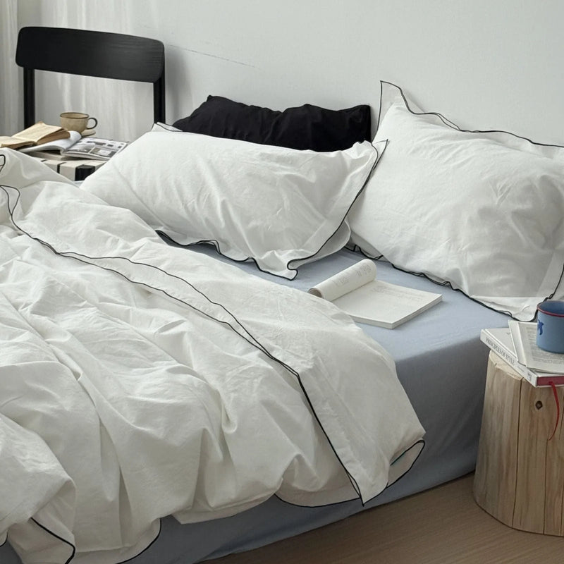

So if you love the idea of a calm, airy room but worry it'll feel like a hotel nobody lives in, a washed white with one quiet line of contrast is the answer. It keeps the breathing room of an all-neutral palette while giving the space just enough character to feel like yours.

The Warm End: Blush And Dusty Lavender Without The Sugar
At the far warm end of the line, calm stops feeling like solitude and starts feeling like being held. This is where most "calming colors" lists get nervous and bolt back to neutrals. But some of the most genuinely soothing bedrooms we've styled live out here, in muted pinks and soft lilacs, the kind grown-ups actually want to sleep in. The fear is that pink reads childish and lavender reads sweet. The fix is desaturation, every time. Drop the brightness and a blush becomes a hush, and a dusty lavender turns into one of the quietest, most luxurious colors you can put on a bed.
The Plush Ruched Fleece Bedding Set anchors this warm end, and it's a two-for-one because it comes in both a Blush Pink and a Dusty Lavender. The ruched, rippled fleece does a lot of the work here: that wavy, light-eating texture pulls the saturation way down so the color never tips into candy. We've shot the blush against a black tufted headboard, and the contrast keeps it from ever feeling twee, while the lavender in a bright room reads soft and a little dreamy. Both are warm calm rather than cool calm, the kind of color that feels like a hug instead of a held breath. In your room, this is the end of the line to choose if you find pure neutrals a touch lonely at night.
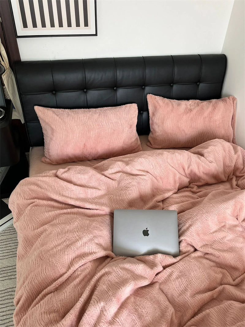
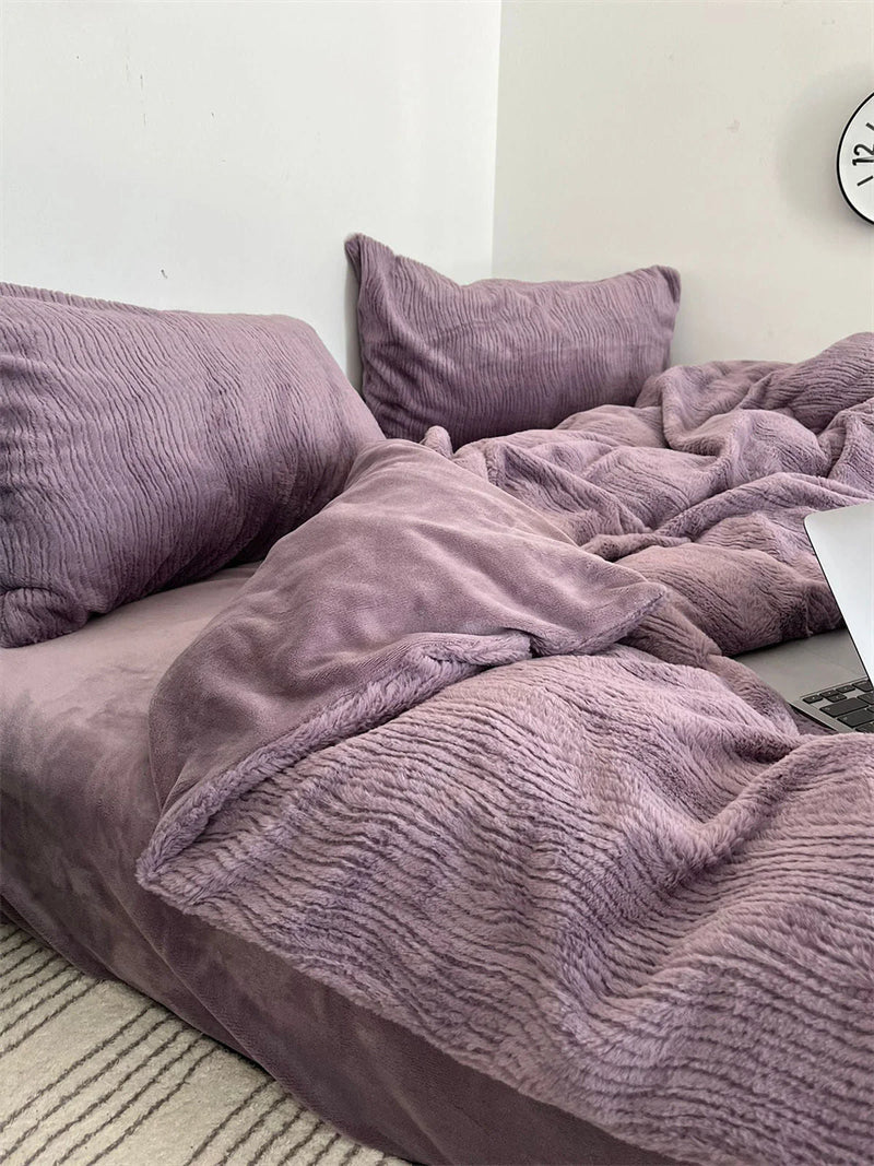
So if you want a bedroom that feels nurturing and not just neutral, a muted blush or a dusty lavender is the move, especially in a brushed fleece that softens the tone for you. This is warmth that still helps you wind down, which is exactly the kind of color that makes a room feel like you instead of like a catalog.

Where On The Line Do You Belong?
The point of laying these out by temperature instead of ranking them is that there's no single winner, there's just where you sit. If your idea of rest is quiet solitude, a still room with a little distance in it, lean toward the cool end and choose the blueberry linen. If you want the color to disappear and simply lower your shoulders, the restful middle of sage is the safest possible bet. If your room runs cold or you find pure neutrals a little lonely after dark, walk to the warm end and let blush or lavender do the holding. Washed white sits in between as the great compromise, neutral but never icy.
One thing holds true the whole length of the line: texture decides whether a color keeps its promise. The same hue can read calm or harsh depending on whether its surface scatters light or bounces it back, which is why every set here lives on a crinkled, slubby, or rippled fabric rather than a glossy flat one. Pick your temperature first, then trust the texture to hold it there at dusk.
A Few Questions We Hear A Lot
These come up so often in the studio and over email that it felt wrong not to answer them here, plainly.
What's the single most relaxing color for a bedroom? If you want one safe answer, a muted, grounded green, because it sits at the thermally neutral middle of the line and works in almost any room. But "most relaxing" really means "lowest saturation, softest texture, holds up in low light," and any color from cool blueberry to warm blush can clear that bar, which is the whole reason we map them by temperature instead of crowning one.
Which bedroom colors actually reduce stress before sleep? Desaturated ones, regardless of where they fall on the line. Soft blueberry, sage, washed white, blush, and dusty lavender all lower visual stimulation, and lower stimulation is what helps your body shift toward rest. Bright, high-contrast, glossy colors do the opposite, they keep a little part of your attention switched on.
Do I have to repaint to get a calmer room? No, and this is the thing we wish more people knew. Bedding is the largest soft field of color in the room and the easiest to change, so swapping in a calmer set is the highest-impact, lowest-commitment move you can make. Paint can wait.
Start With The Color You'd Want To Wake Up Beside
You don't have to overhaul the whole room. Pick the one spot on the line that made your shoulders drop a little just reading about it, and start there, with the surface you're closest to every single night. Trust the dusk test if you can run it, leave a set made up and see how it reads after dark, but honestly, trust your first instinct too, the right calming color tends to make a quiet first impression and a quieter one every day after.
Because the real goal was never a magazine-perfect bedroom. It was a space that feels like you, one that breathes out the second you walk in. The right color won't shout that you've decorated. It'll just let the room get quiet, and let you get quiet with it. When you're ready, our full Bedding Collection is where every one of these calm tones lives.
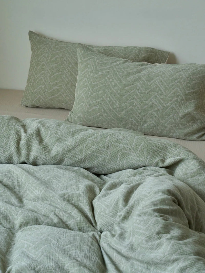
Soft Crinkled Geometric Washed Cotton Bedding Set
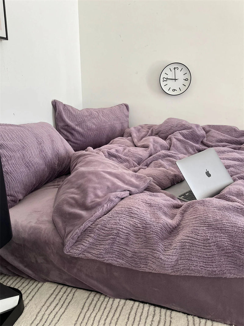
Plush Ruched Fleece Bedding Set
Written by Mara Quinn, RoomDen styling editor. We style and sit with every bedding set under our own studio daylight before it ever ships, which is where this whole cool-to-warm map of calm came from. Last updated June 2026.


