
Coastal Bedding Ideas for a Breezy, Restful Bedroom
A stylist's order of operations for coastal bedding: choose washed-cotton texture first, let the drape do the breezy work, and add blue only as a final edge.

Most coastal bedding ideas fall apart at the checkout button, not on the bed. You pick a blue-and-white set because it photographs like a breezy beach house, it arrives, you put it on, and somehow it reads like a theme-park gift shop instead of a calm room you want to nap in. We've watched this happen enough times to know it isn't a taste problem. It's a layering problem. A coastal bed isn't one purchase you get right or wrong; it's a short stack of decisions, and the order you make them in is what separates "serene" from "novelty."
So this guide is built as a decision, not a mood board. We'll walk the three layers that actually carry a coastal bed (in the order we build them when we dress one in the studio), and at each layer we'll show you the call that keeps it from tipping into cliché. We call the whole approach the Soft-Stack Method, and once you see a bed in these three moves, you can't unsee it.
Contents

Why Coastal Bedding Goes Wrong at the Buy Button
Here is the trap, and almost everyone walks into it. You search "coastal bedding," you sort by the bluest, most beachy-looking result, and you buy the set that screams the loudest about the sea. That set photographs great on a white seamless backdrop. In an actual bedroom, under actual lamplight, it does the opposite of what you wanted: the saturated navy goes flat and heavy, the printed shells or stripes start to feel like a costume, and the bed ends up looking cheaper than it cost. The set didn't fail. The buying logic did.
The second trap is texture you can't see in a thumbnail. A lot of coastal sets are smooth, flat percale, the kind that holds a hard crease and reflects light back at you in a glossy sheet. Online it looks crisp and clean. In person it looks stiff, and stiff is the enemy of breezy. The version that actually feels like a slow morning by the water is almost always a washed, crinkled cotton, where the wrinkle is a feature, not a flaw. The problem is you cannot price that difference from a product grid, which is exactly why a method beats a wishlist.
The Soft-Stack Method: Three Layers, One Order
Strip a coastal bed down and it's three layers doing three different jobs, stacked from the body outward. Layer one is the field you actually sleep against, the duvet cover and pillowcases that set the base tone and, more importantly, the base texture. Layer two is the drape, how that fabric falls, folds, and refuses to lie perfectly flat, which is where almost all of the "breezy" feeling actually comes from. Layer three is the accent, the small dose of color or trim you add last, and the one people fatally do first.
The whole point of the Soft-Stack Method is the order. Choose texture, then drape, then color, in that sequence, and a coastal bed almost can't go wrong. Reverse it (lead with the bluest set and hope the texture sorts itself out) and you're back at the gift-shop bed. We tested this the boring way: we dressed the same frame in our studio three times, once leading with color and twice leading with texture. The color-first bed needed five props and still looked themed. The texture-first beds needed nothing but a folded-back corner. The order isn't a preference. It's the whole trick.

Layer One: The Field You Sleep On
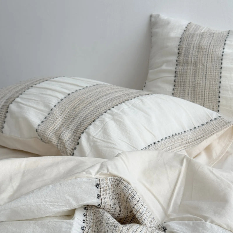
Everything rests on the base set, so this is the decision that deserves the most of your attention and gets the least. The field is the duvet cover plus shams that fill most of the visual frame. Get the tone and texture right here and the rest is small. Get it wrong and no amount of accent pillows will save it.
Pick the Crinkle Before the Color
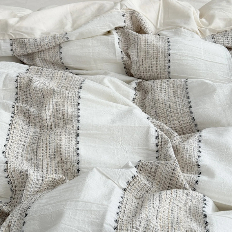
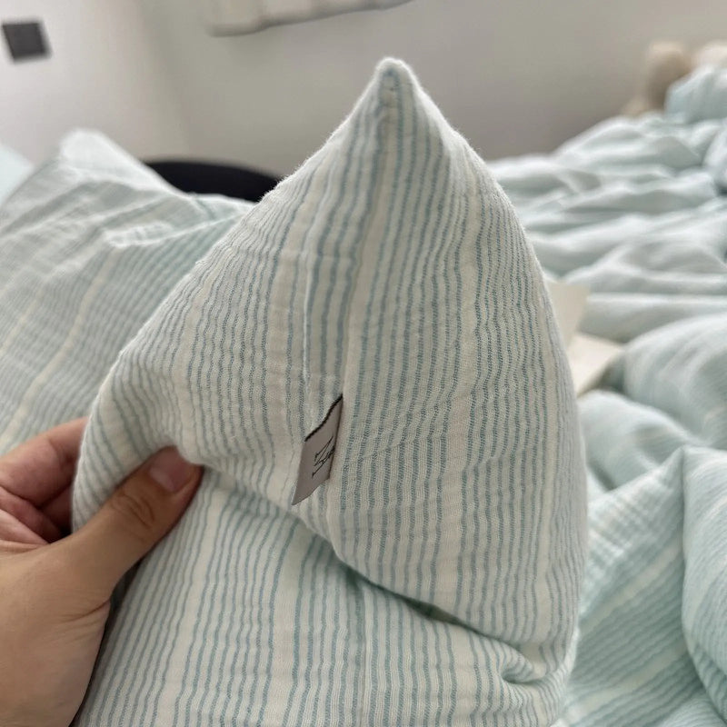
The single most useful coastal bedding decision is to choose the hand of the fabric before you choose its color. Washed cotton is our default for one concrete reason: the crinkle is baked in during finishing, so a single cover already gives you the rumpled, lived-in surface that flat cotton only fakes after a few nights of sleep. That means the bed looks intentionally relaxed straight out of the package, instead of looking like you forgot to iron it. When we shot our woven-stripe set in oatmeal beige, we made the bed once, walked away, and the soft wrinkles did all the styling, no tugging, no smoothing. The texture is the work, and the fabric does it for you.
Here's the buyer's tell for spotting it online: look for a close-up image where the fabric folds in soft, irregular waves rather than sharp pressed lines, and check that the product copy says washed, crinkled, or stonewashed. If every photo is shot smooth and flat, assume it's flat in person too.

The Warm-Neutral Base vs. the Blue Base
Now the color call, and it's really a fork: do you build your base in warm-neutral and treat blue as a guest, or do you commit to blue as the field itself? Both can work, but they age very differently, and this is the decision the gift-shop beds get backwards.
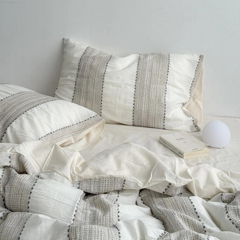
The warm-neutral base (oatmeal, sand, foam-white) is the safer, longer-lasting bet. It reads coastal because it mirrors the colors a shoreline is actually made of, the dry sand and weathered wood, not the postcard water. It also shape-shifts with the light, photographing cool at dawn and warm at dusk, which is exactly the quiet flexibility a restful bedroom wants. The blue base is the bolder play. It can absolutely be beautiful, but a saturated blue field has a short runway before it tips into theme, so if you go blue, go soft and washed-out, never bright nautical. Our honest take, from restyling a lot of beds: start neutral on the field and let blue arrive later, at layer three. It's the version we'd still like in two years.
Layer Two: The Drape That Does the Breezy Part
This is the layer nobody shops for and everybody feels. "Breezy" isn't a color and it isn't a print; it's a behavior. It's how the fabric falls off the side of the mattress, how it pools instead of hanging stiff, how it holds a soft shadow in its folds instead of a hard pressed line. A relaxed, crinkled cover gives you this for free, which is the entire reason a washed pinstripe can look styled when you've done nothing to it but pull the duvet up halfway.
The move at this layer is restraint, not addition. Use one fewer pillow than the showroom photo. Let the cover drape past the edge of the bed instead of tucking it tight underneath. Fold the top corner back instead of squaring it off. We left a pinstripe set deliberately unmade for a shoot, dropped an open book on the pillow, and that was the frame the whole team kept reaching for, not because it was neat, but because the slack in the fabric read as ease. The rumple is the styling. Your job at layer two is mostly to get out of its way.


Layer Three: Where the Blue Earns Its Place
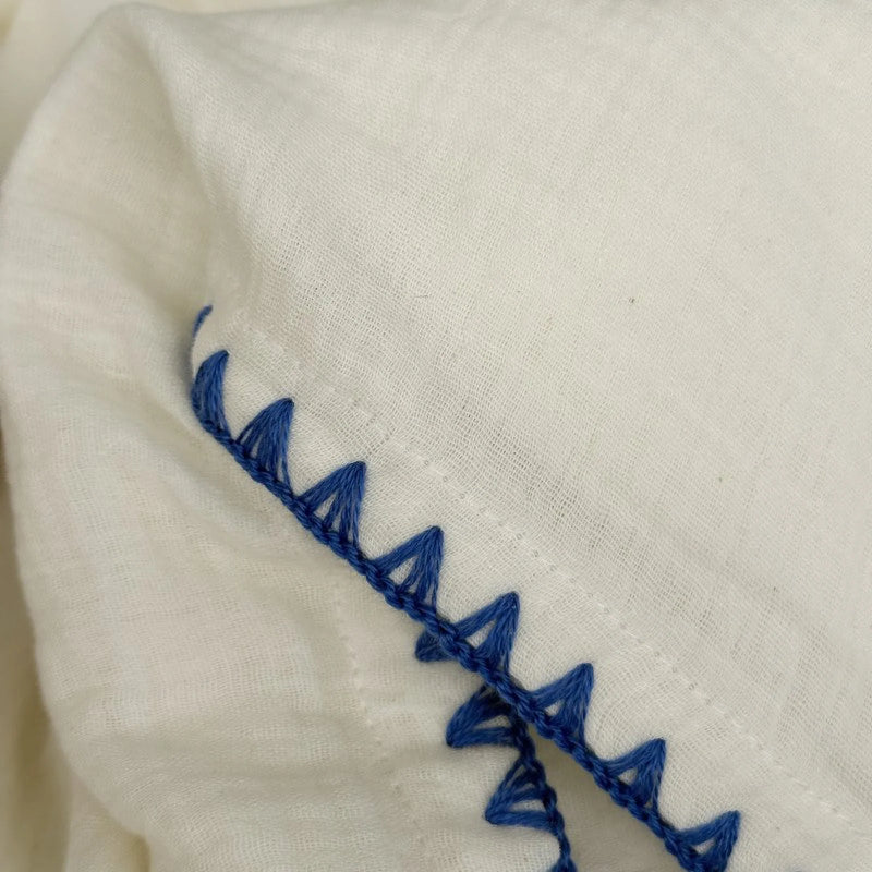
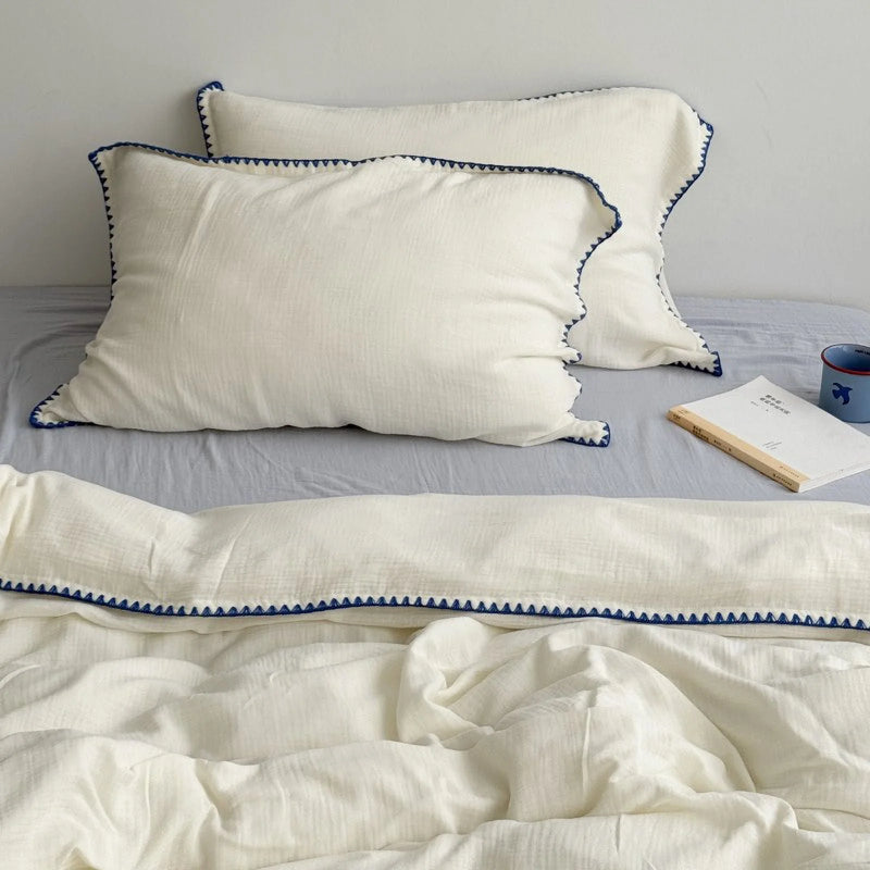
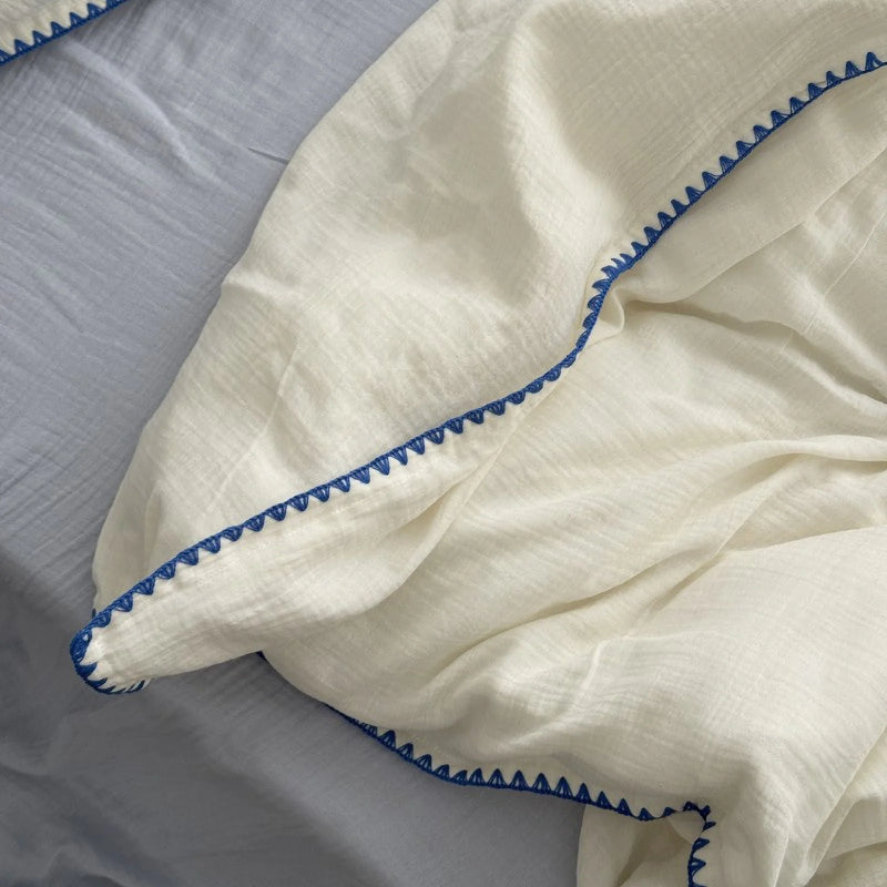
Now, and only now, you add color, and you add a little. This is the layer most people start with and ruin, because a coastal bed wants blue as a punctuation mark, not a paragraph. The most believable way to wear it is as an edge: a fine embroidered trim, a single piped seam, a hairline of color that catches your eye and then releases it. Think of the one dark line a wave leaves on wet sand, that's the dose, not the whole flood.
Our cream washed-cotton set is built exactly on this idea: the blue lives entirely in a triangular embroidered border, while the field stays soft and pale, so the room reads calm and considered instead of cold or themed. That restraint is what tips a set from "mentions the sea" to "lives near it." If you followed the Soft-Stack order, neutral field, easy drape, and only here a slim line of blue, you've spent your whole color budget on the one inch that actually reads, and skipped the navy flood that ages badly. Pair it with one pale linen-toned throw at the foot and a near-bare wall behind the headboard, and you're done.

A Quick Buyer's Gut-Check Before You Add to Cart
Before you commit to any coastal set, run the test we use in the studio before we trust one: the 3-meter squint. Pull up the product's lifestyle photo, or stand back from your own made bed, then back off about three meters and half-close your eyes until the detail blurs. If the surface dissolves into a soft, even haze with no hard edges, it's genuinely coastal and it'll feel restful in the room. If you still see a crisp seam, a glossy sheet of reflected light, or a flat block of saturated color, it's reading too sharp, and no amount of seashell decor will fix it. Lower the contrast, soften the texture, or move the blue to the edge.
The squint is really just the Soft-Stack Method in fast-forward: texture that scatters light, drape that softens edges, color kept to a whisper. The editors at Architectural Digest land on the same conclusion from a different angle in their coastal bedding roundup, that serenity comes from material and restraint, not from motif. Every set we put on this page passes the squint, which isn't luck. It's the reason they made the list.

Start With the Bottom Layer
You don't have to redo the whole room, and you definitely don't have to buy the bluest thing you can find. A breezy, restful coastal bedroom starts with one decision made in the right order: a washed-cotton base in a soft, warm-neutral tone, dressed loose and left a little unmade. That's layer one. The drape and the slim line of blue come after, and they come easily once the foundation is right.
When you're ready to lay down that bottom layer, all of our washed-cotton sets live together in one place, so you can shop them by texture first the way the Soft-Stack Method asks. Run each one through your own 3-meter squint and trust the one that goes soft.

Written by the RoomDen styling desk — we dress and shoot every bedding set in our own daylight studio, restyling each bed until it passes the 3-meter squint, before it ever goes live. Last updated June 2026.


