
Soft Girl Room Decor: Plush, Ruffled & Cozy (Not Just Pastels)
Soft girl decor isn't a pastel palette, it's a feel under your fingers. We sort the look into three touch families, brushed-washed, ruffled, and plush, plus one bold note to keep it from going...

We had a soft girl room decor flatlay that was technically perfect and completely dead. Right palette, blush and butter and a little lilac, every prop placed, and on the back of the camera it looked like the lid of a candy tin: smooth, sweet, and about as touchable as a phone case. Nothing in the frame asked to be reached for. The fix wasn't a different pink. It was swapping in fabrics with an actual surface, a ruffle, a wash, a deep fleece, until the photo stopped being a color story and started being a touch story. That shoot is the whole reason for this guide: soft girl is a feeling under your fingers, not a swatch on a wall, and the rooms that work are built from texture you'd cross a room to go touch.
So instead of sorting by color, we sort by touch. We think of soft girl texture as three families that sit side by side, not a scale from less-soft to more-soft: the brushed-washed family (everyday lived-in cotton), the ruffled-trimmed family (soft with a detail you follow), and the plush-sherpa family (the deep pile you disappear into). None outranks the others; a good room invites a hand from all three. And because a room made of nothing but soft families goes saccharine fast, we deliberately drop in one piece that doesn't belong to any of them: a single graphic, structured note that makes all the softness suddenly legible.
Contents

Soft Is a Texture, Not a Color Swatch
Search "soft girl room" and you get a wall of pastel paint chips: blush, lilac, butter, sky. Those are fine. But color is the easiest thing to copy and the first thing to date. Our candy-tin flatlay was perfectly on-palette and still felt like a phone case, all surface, nothing to touch. The fix was never a different pink. It was adding things your hand wanted to reach for.
That's the whole premise here. A soft girl space earns its name through hand-feel: washed cotton that's gone soft from its finish, a ruffle that breaks a flat edge, a fleece deep enough to disappear into. Get the textures sitting together and the palette almost handles itself, because soft fabrics catch light gently and read warm even in a cool color. Get only the colors and you've built a mood board, not a room.
One honest note before we get into it: most of the pieces we love here are bedding and loungewear, the soft girl stuff you live in, not just look at. We lean that way on purpose. The bed is the biggest soft surface in any room, and what you sleep in is the texture closest to your skin, so that's where touch matters most.
The Three Touch Families
Here's how we group it. Three families of touch, sitting side by side rather than stacked in any order: brushed-washed, ruffled-trimmed, plush-sherpa. You don't owe any one of them a fixed share, and none is "more soft girl" than the rest. A room just reads richer when a hand can find all three. We'll hang one real piece in each family so you can feel where they differ.
Brushed & Washed
The brushed-washed family is the everyday soft, the texture you touch most without thinking: your bedding. The problem with most "soft girl" beds is that they go for one flat pastel and stop. How do you keep a bed soft and sweet without it reading like a kids' duvet? Texture, not just hue. Washed cotton with a little tonal print does the work, because the wrinkle and the wash give your eye somewhere to land.
This is where our Textured Colorful Polka Dot Washed Cotton Bedding Set lives. The dots keep it playful, but it's the washed-cotton hand that makes it soft girl rather than nursery, slightly crinkled, lived-in, the kind of surface that looks better a little rumpled. In our own shoots we left it deliberately unmade, threw a paperback on the duvet, and it read cozier than any crisply-ironed set we tried.
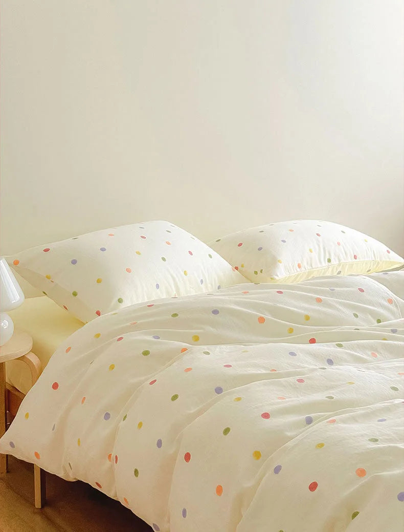
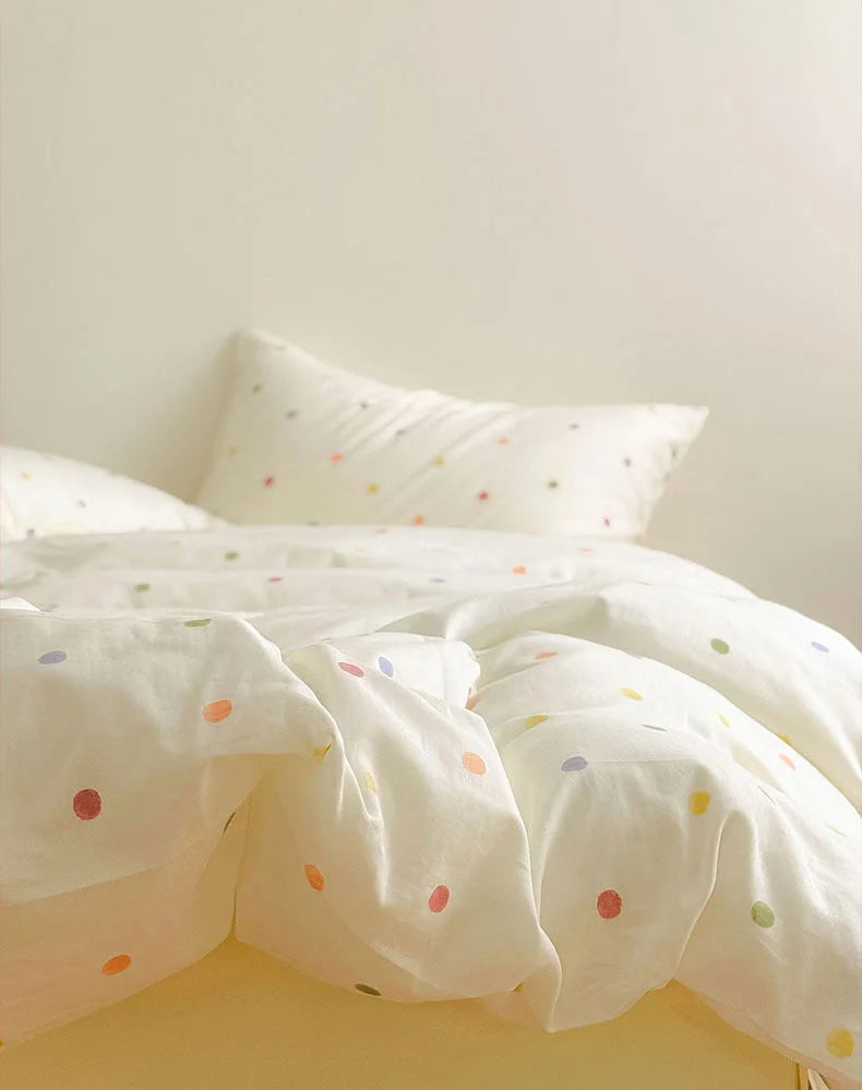
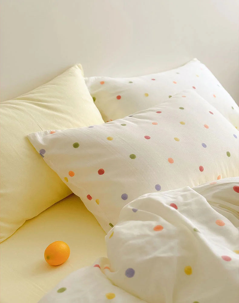
Why it works: the wash softens both the fabric and the print, so the pattern whispers instead of shouting. That's the texture you're in contact with most, sweet but with a real surface to it. The other families lean on it.
Ruffled & Trimmed
The ruffled-trimmed family is where soft gets specific. A ruffle, a contrast trim, a hem that catches the light, these are the small details your eye snags on and your hand wants to follow. What separates a soft girl look from generic "cute" is exactly this: the trim work. Without it, soft is just blank. With it, soft has a personality.
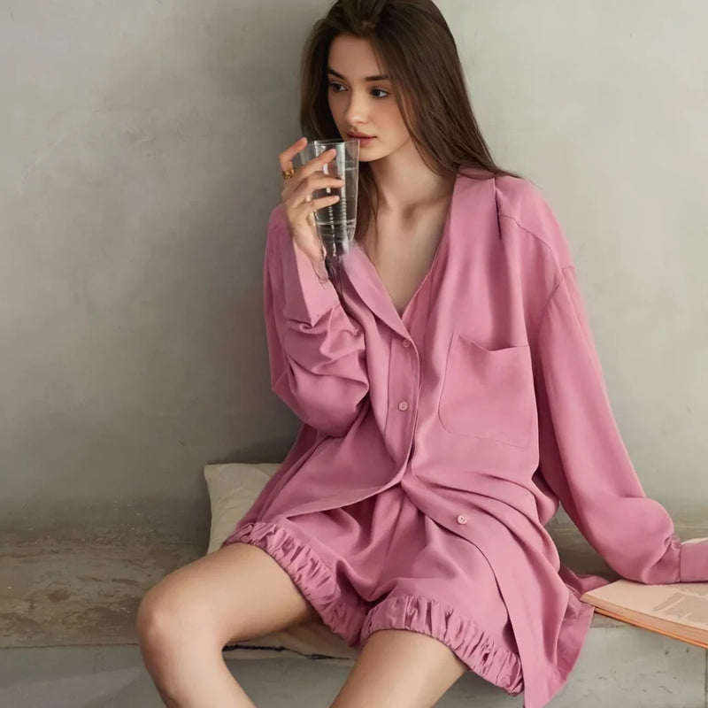
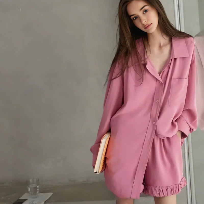
Two pieces belong here. First, the Soft Ruffle Hem Cotton Pajama Set in dusty rose, where the ruffled shorts hem is the entire point, a little break of movement against an otherwise clean cotton. We styled it for a morning shoot and the ruffle did all the talking; it's the difference between "pajamas" and "an outfit you'd answer the door in."

The second piece in this family trims the soft a different way. The Soft Contrast Trim Cotton Pajama Set in lavender runs a darker line along the pocket and collar, so the softness has an edge drawn around it. Same idea as the ruffle, opposite execution: instead of adding movement, it adds definition. How do you keep a lavender set from going washed-out? Outline it. The trim is what stops pale from reading as faded.
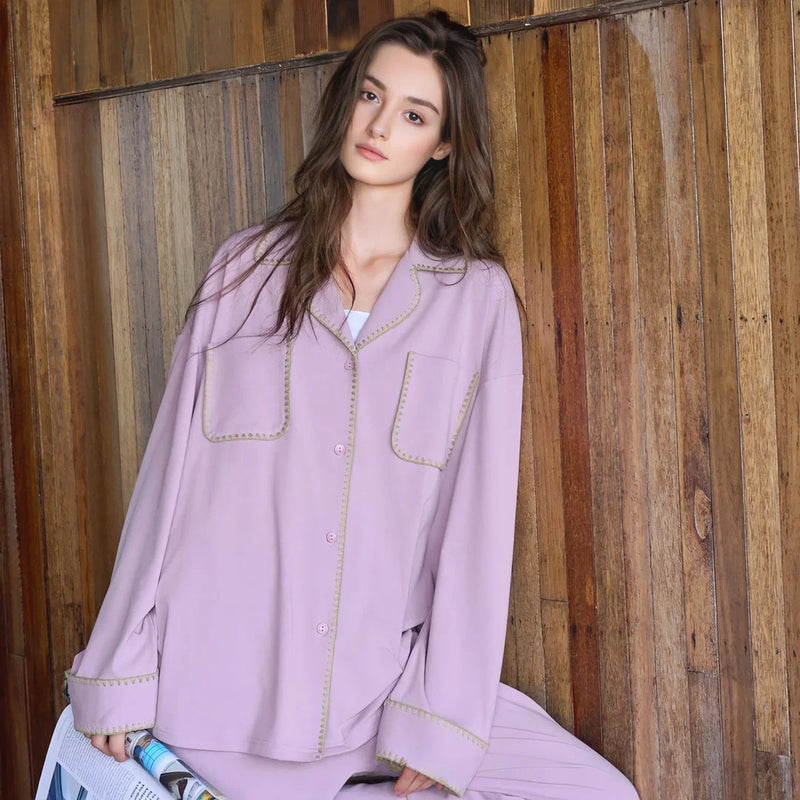

Why both work: this family is what keeps soft from sliding into bland. A ruffle adds motion, a trim adds a boundary, and either one gives the eye a reason to stay. It's the family most pastel rooms skip, which is exactly why they look unfinished.
Plush & Sherpa
The plush-sherpa family is the deep soft, the texture you don't just touch but fall into. This is where a soft girl room turns into a soft girl nest. When the weather turns and the room needs to feel like a hug, flat cotton isn't enough; you want pile, the kind your hand disappears into. The question we get most in cold months: how do I make a cute room feel actually warm, not just look it? Depth of texture. Fleece and sherpa do in fabric what a thick rug does on a floor.
The Ultra-Plush Button-Up Flannel Fleece Pajama Set in cream is the easy way in, a quiet, deep-pile soft that reads grown-up rather than babyish. We shot it on a grey afternoon, hugging a pillow, and the fleece flattened the light into something soft enough to nap in. It's the plush that doesn't try to be cute, it just is warm.

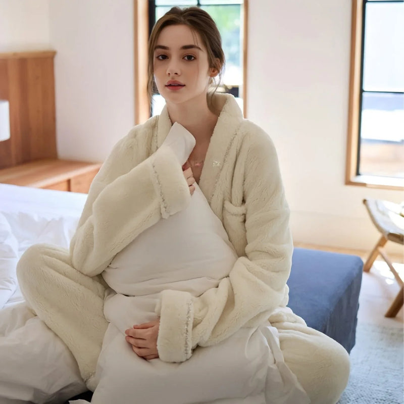
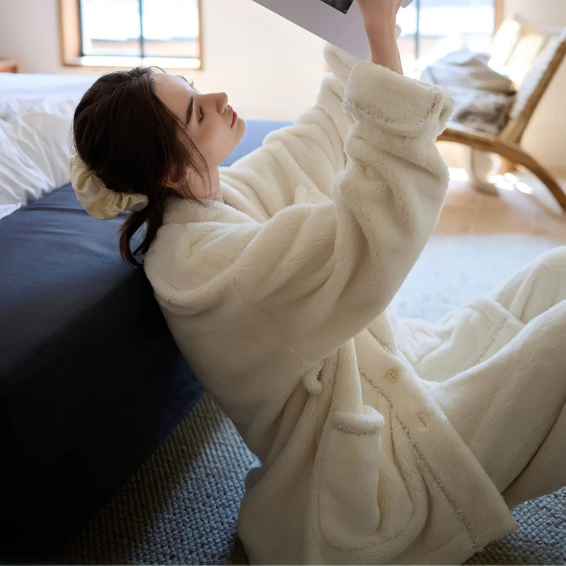
For the deepest pile in the family, the Plush Sherpa Fleece Pajama Set in creamy beige goes one step further, the sherpa nap that's all texture and no sharp edges. This is as sink-in as it gets. In our softly lit shoot the model genuinely fell asleep on the couch in it, which felt like the most honest product photo we've taken. If the cream flannel is a warm soft, the sherpa is a heavy, swaddled soft, the deepest end of the whole wardrobe.

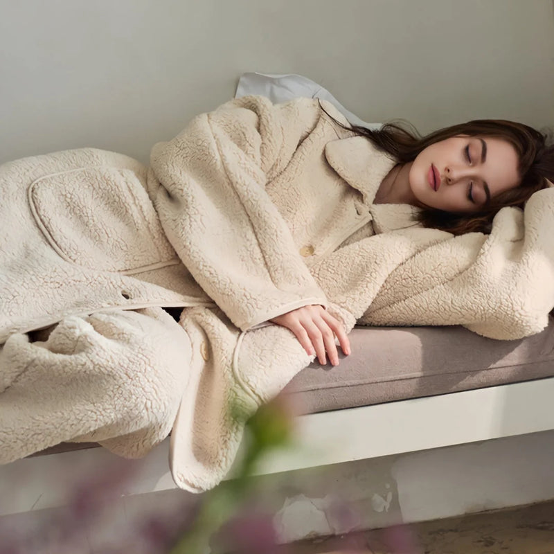
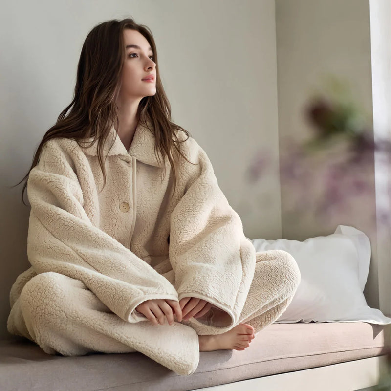
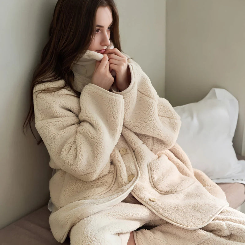
Why this family matters: depth is what makes a soft room feel safe instead of just pretty. Flat fabric reads cold no matter the color; pile reads warm no matter the season. One deep-soft piece anchors the whole nest.
The One Hard Note: Your Contrast Anchor
Now the part most soft girl guides won't tell you. A room built only from the three soft families, all brushed and ruffled and plush, can tip into too-sweet, the visual equivalent of a dessert with no salt. The trick we use in nearly every shoot is to drop in one deliberately graphic, structured piece. Not to break the softness, but to make it legible. Contrast is what lets the eye register how soft everything else is.
Our hard note here is the Plush Bold Striped Fleece Pajama Set in pink and green. It's still fleece, still genuinely plush to the touch, so it could pass for the plush family, but those bold, blocky stripes are the structured, almost preppy graphic that cuts through the haze of solids and pastels. We added it to an all-soft flatlay that had gone a little sleepy, and the stripes snapped the whole image awake. That's the contrast anchor doing its job: one piece of structure makes the surrounding plush look intentional rather than accidental.
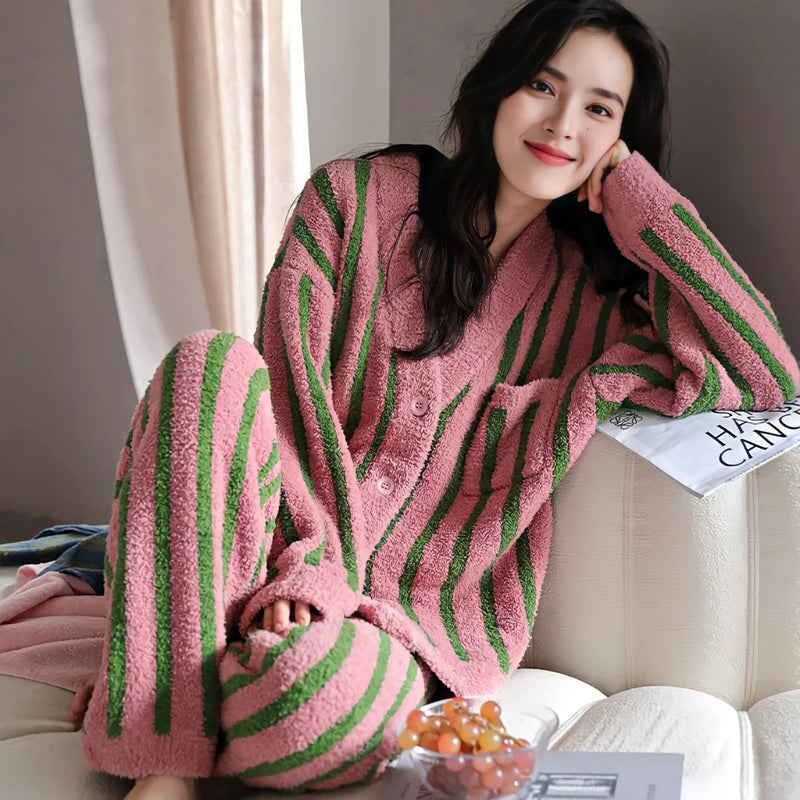
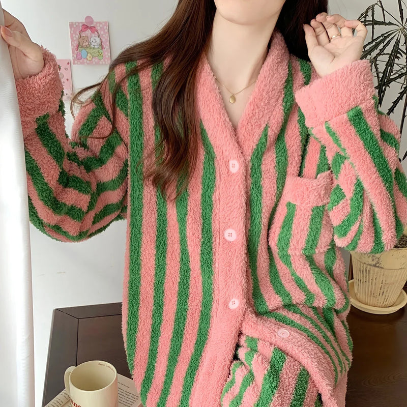
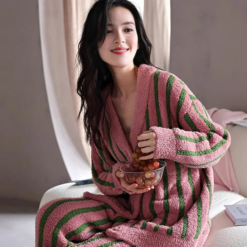
Why it works: a single graphic, structured note keeps the room from dissolving into sugar. Bold stripes against soft solids is the salt in the dessert, and because the stripes sit on plush fleece, the contrast is graphic without ever turning cold. One hard note, that's the whole rule. Two and you've started building a different room.
Letting the Families Share a Room
Mixing the families isn't about owning one of everything. It's about range of touch. A bed in washed cotton from the brushed-washed family, a ruffle or trim you reach for from the ruffled-trimmed family, one deep piece to sink into from the plush-sherpa family, and a single structured note to keep it all honest. That's a soft girl room that holds up past the first photo.
The proportion we use: lots of brushed-washed, because it's the biggest surface and the most-touched; a couple of ruffled-trimmed pieces for character; one generous plush-sherpa piece for warmth; and exactly one contrast anchor. Lean too hard on plush and the room gets heavy and naptime-only. Stay only on washed cotton and it stays flat. Thinking in families is really just a reminder to spread your softness across different sensations instead of buying the same soft five times.

One thing we keep relearning in tight spaces: soft texture forgives a small room. A bright pastel can make a dorm or a rental box feel like a toy box, but a mix of textures in a quiet palette makes the same room feel like a refuge. When square footage is short, let the families do the work the color was failing at.
Pick the Texture You're Missing
You don't build this in a weekend, and you shouldn't. Look at your room and name the family that isn't there. All flat pastel? You're missing brushed-washed; start with bedding that actually has a surface. Cozy but a little sleepy? You're missing the hard note; add the contrast anchor. Soft girl decor rewards the slow build, one texture you genuinely love to touch, then the next.
Our usual advice: begin with the bed, because it's the largest soft surface you own, then add the piece you'll live in on the coldest night. Two real textures beat a whole room of matched pastel. Everything else grows from there.

Textured Colorful Polka Dot Washed Cotton Bedding Set

Plush Sherpa Fleece Pajama Set
Want the whole edit in one place? Our Soft Girl Aesthetic Room Decor collection is where these textures live, the plush, the ruffled, the washed cotton, and yes, the one bold stripe to keep it honest. Pick your missing family from there.
Styled and written by the RoomDen styling desk. We style every product in our own daylight studio before it ships, and we wrote this from the actual shoots, including the candy-tin flatlay that fell flat and the one where the sherpa set put our model to sleep. Last updated June 2026.


