
The Gen Z Guide to Cottagecore Bedroom Decor (2026)
A stylist's room-by-room guide to building a cottagecore bedroom that feels handmade, not staged — from washed gingham bedding to wall gardens and the wind-down corner most guides skip.

Cottagecore bedroom decor gets sold to you as a shopping list: add florals, add lace, add a vintage frame, done. We have styled enough of these rooms in our own daylight studio to tell you that list is exactly why so many of them end up looking like a costume instead of a home. A cottagecore bedroom isn't a pile of motifs. It's a room that knows what to do with soft morning light, and a few honest textures that get better the more you sleep in them. This is the long version of how we'd build one in 2026 if it were ours, told through the real pieces we keep reaching for on set.
We'll walk the room the way light walks it: the bed first, then the walls, then the quiet wind-down corner most guides forget. Along the way we'll hand you the one rule we use to vet every single cottagecore piece before it earns a place in the frame.
Contents
The Daylight Test (Our One Rule for Cottagecore)
Before any product, here's the framework we use, and the one we want you to steal. We call it the Daylight Test. The idea is simple: hold a piece up to plain, soft, mid-morning daylight (the kind that comes through a sheer curtain around 9am) and watch three things. Does the color warm and settle, or does it go flat and slightly plastic? Does the texture catch the light and throw a little shadow, or is the surface dead-smooth? And does the pattern read like something a person made, or like something a machine printed at full saturation?
Cottagecore lives or dies on those three answers, because the whole aesthetic is really about light and the memory of handwork. We learned this the hard way. On one early shoot we put a cheap glossy "floral" throw next to a washed-cotton set on the same bed, same window, same hour. From three meters away the glossy one looked like a screenshot of a flower; the washed one looked like a flower someone had pressed in a book for a decade. Same color story, completely different room. Now nothing gets on the bed until it passes the test. Every product below earned its place this way, and you can run the test on anything you already own before you spend a cent.

What Actually Makes a Bedroom Cottagecore
If you've been collecting pins, you already feel the look before you can name it. Let's name it, because knowing the four load-bearing parts is what lets you stop buying random florals and start building a room that holds together.
The four things every version shares
Strip away the trend noise and a cottagecore bedroom comes down to four ingredients. Natural texture first: washed cotton, real lace, brushed weaves, anything your hand wants to touch. Soft, low-saturation color second: sages, dusty pinks, butter creams, faded blues that look like they've been in the sun. Botanical pattern third, but pattern that's drawn rather than blasted, so ditsy florals, wildflowers, gingham, vines. And a trace of handwork last: a ruffle, a piped edge, an embroidered trim, the little human stitch that tells you a person was here. Get those four right and the room is cottagecore even before you hang a single print. Miss them and no amount of mushroom wallpaper will save it.
Notice what isn't on that list: clutter. The single most common mistake we see is treating cottagecore as "more stuff." It isn't. Leave the room some breathing space, some plain wall, some empty surface for the light to land on. The quiet is doing as much work as the florals.
Is it still worth doing in 2026?
Short answer: yes, more than ever, and here's why we're confident. The pure fairy-tale version (think full-on prairie dress energy) has cooled, true. But what's actually happening is that cottagecore grew up. It blended with quieter, more grown-up aesthetics, and the result is the soft, lived-in, slightly imperfect bedroom that's everywhere on our customers' boards right now. People aren't searching for a theme park; they're searching for a room that feels calm and handmade. So if you're wondering "is this dated," the honest read from where we sit is that the costume version is fading and the livable version is just getting started. That's the one this guide builds.
Start at the Bed (It's 60% of the Room)
Here's the rule we'd put on a sticky note: in a bedroom, the bed is roughly sixty percent of what your eye sees the moment you walk in. So if your budget or your patience only stretches to one good decision, make it the bed. Get the bedding right and a plain rental room reads cottagecore instantly; get it wrong and the prettiest wall art in the world is fighting a losing battle behind a sad duvet.
Pattern that reads soft, not loud
So what does a Daylight-Test-passing bed look like? We keep coming back to the Lace Ruffle Gingham Washed Cotton Bedding Set. Gingham is the sleeper move of cottagecore: it's a check, so it's structured enough to keep a busy floral room from going chaotic, but in a washed, faded blue it goes gentle instead of picnic-table loud. The washed-cotton hand is the whole point. It crinkles, it throws soft shadow, it photographs like it's already been loved for a year. And the lace ruffle trim is that trace of handwork doing its quiet job along the edge of every pillow.
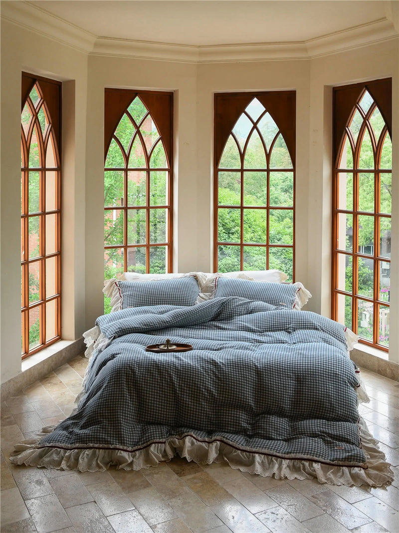
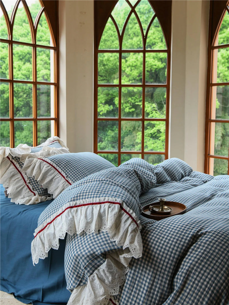
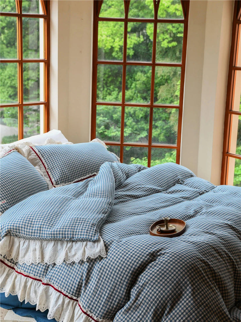
Why does this work as the foundation piece? Because it carries the whole room without a second decision. The gingham is the structure, the wash is the texture, the faded blue is the soft color, and the ruffle is the handwork, all four cottagecore ingredients living in one set you sleep on every night. Everything else in this guide is just an accent on top of a bed that already passed the test.
The print-vs-texture question
One question we get constantly: should the pattern be on the bedding or somewhere else? Our take after a lot of trial and error is that the bed should lean textured rather than busy. Let the big botanical statement happen on the walls (next section) where it's flat and easy to read, and let the bed do the touchable, low-key work. A washed gingham or a tonal floral on the bed plus a louder garden on the wall is a far calmer balance than a screaming floral duvet trying to be the whole show. The bed is where you put your face every night; it should feel soft, not shout.
If you want to go deeper on just the bedding layer, our whole floral bedding edit is built around exactly this print-versus-texture balance, with the same washed hands we trust on set.
Give the Walls a Garden, Not a Gallery
This is where most cottagecore bedrooms either bloom or collapse. The instinct is to buy one big framed print, hang it dead center, and call the wall done. That's a gallery move, and galleries feel formal, the opposite of what we want. Cottagecore wants a garden on the wall: a slightly overgrown, asymmetrical cluster that looks like it accumulated over time rather than arriving in one box. The good news is you can fake "accumulated over time" in an afternoon, and you don't need to commit to nails if you're renting.
The trick we use is a collage kit, because it gives you a dozen-plus coordinated pieces in one go and lets you arrange them loose and imperfect. The Matte Vintage Tulip & Quote Kraft Paper Wall Collage Kit is our go-to for the warmer, more antique end of the look. The matte kraft paper is doing real work here: it passes the Daylight Test where a glossy poster would fail, soaking up light instead of bouncing a harsh sheen back at you. The tulips read hand-drawn, the quote cards break up the florals so it doesn't get monotonous, and at this price you can cover a real stretch of wall without flinching.


If your room leans cooler, brighter, or more "Danish pastel" than antique, swap the kraft for cardstock. The Matte Botanical Daisy & Quote Cardstock Wall Collage Kit runs in a fresher sage-and-cream palette, and because it ships with round stickers you can stage the whole cluster, live with it for a week, and re-tile pieces without leaving holes. That re-arrangeability is underrated. A wall garden is never "done"; it's something you nudge as the seasons change, and renters get to do it with zero damage.


One arranging note from doing this on set more times than we can count: don't center it. Push the densest part of the cluster slightly off to one side, let a few pieces trail away like the garden is spreading, and leave plain wall around it to breathe. The asymmetry is what sells the "grew over time" feeling. A perfectly gridded set of prints reads corporate; a loose, lopsided cluster reads cottage.
The Wind-Down Corner Nobody Tells You About
Every cottagecore guide stops at bedding and walls. We think that's why so many of these rooms look great in a photo and feel incomplete in real life. A bedroom isn't a stage set; it's where you actually go soft at the end of a day. The cottagecore feeling, the slow, gentle, handmade calm, has to extend to what you wear and how you wind down, or the whole thing is just surface. This is the layer that turns a pretty room into a room that loves you back.
What you sleep in is part of the decor
Here's a reframe that changed how we style these rooms: the pajamas count. When you're reading in bed or padding to the kitchen for water, what you're wearing is in the frame just as much as the duvet is. The Silky Ditsy Floral Modal Pajama Set is our pick because it carries the exact same design language as the bed, ditsy floral, soft sage, that drawn-not-printed pattern, but in a fabric that drapes. Modal has a quiet sheen and a cool, fluid hand that passes the Daylight Test beautifully; it catches a little light without ever looking shiny or synthetic. Put it on and you become part of your own color story.


The morning robe ritual
The last piece is the one that makes a bedroom feel like a cottage instead of a showroom: a robe you actually reach for. There's a small ritual to a good morning, coffee, slow light, something soft over your shoulders, and the robe is the prop that completes it. We styled the Plush Sage Striped Long-Staple Cotton Robe on a window-bench shoot and it was the piece everyone in the room wanted to keep. Long-staple cotton is plush without being heavy, the faded sage-and-rust stripe is vintage in the gentlest way, and the shawl collar and deep pockets are built for actually lounging, not just looking lounge-y. It passes the Daylight Test on touch alone.


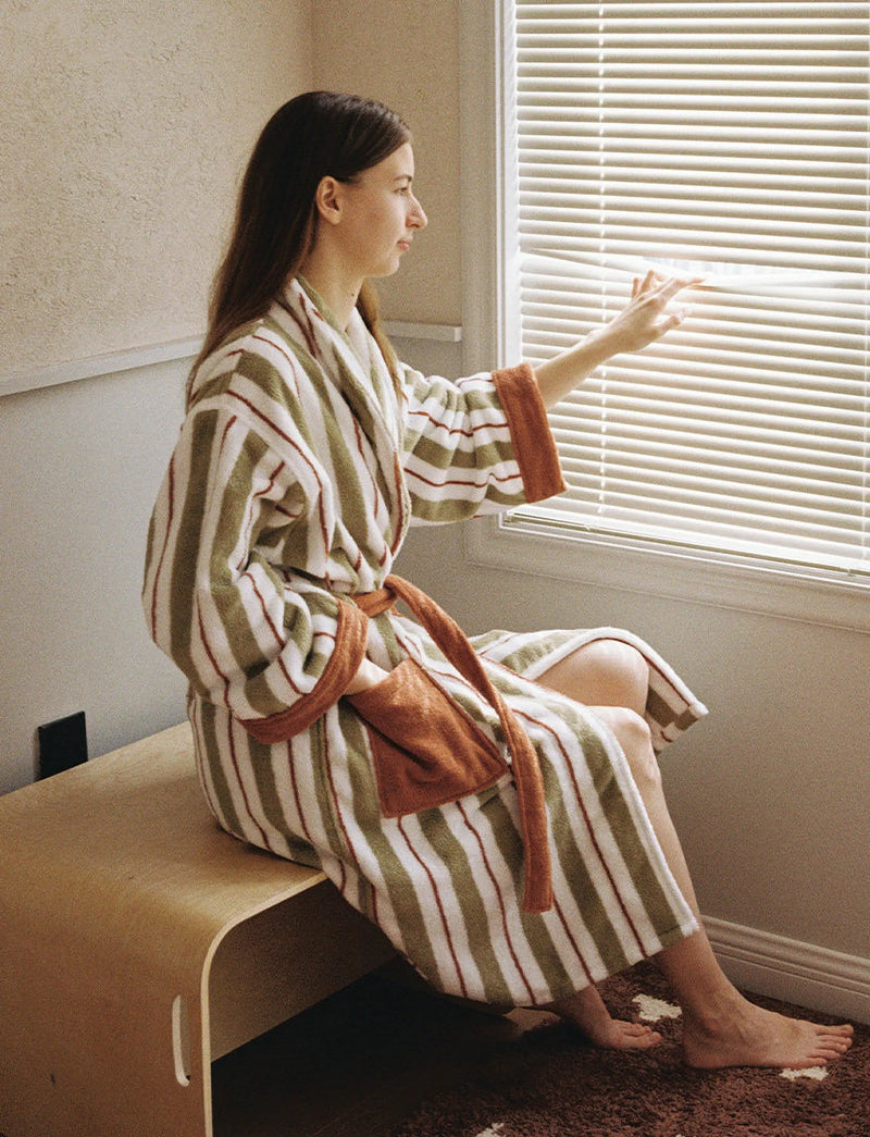
If your palette runs warmer and sweeter, the Plush Pink Tulip Cotton Robe is the coquette-leaning cousin, same plush cotton, but in a hand-painted pink tulip print that pulls the same botanical thread as the wall garden. It's the piece our customers most often buy in a matching pair, which is its own kind of cottagecore: soft mornings shared rather than staged.


Cottagecore, Modern, Dark: Picking Your Dialect
"Cottagecore" isn't one room; it's a family of dialects, and knowing which one you're speaking keeps you from buying pieces that quietly fight each other. Three are worth naming. Modern cottagecore is the grown-up version we mentioned earlier: keeps the texture and botanicals, drops the twee, leans on quiet sages and creams and lots of negative space. That's the lane the washed gingham bed and the daisy cardstock wall live in, and it's the most livable for a real apartment.
Then there's dark cottagecore, which swaps butter creams for forest greens, deep berry, and moody florals; think mushroom, moss, candle-lit. You'd run the same Daylight Test, just chase pieces that hold richness in low light rather than glow in bright. And coquette-leaning cottagecore tips sweeter and more romantic, all dusty pinks, bows, and tulips, which is exactly where the pink tulip robe belongs. None of these is more correct; they're just different accents of the same soft, textured, handmade grammar. Pick one as your lead dialect, let the others appear only as the occasional guest, and the room will feel intentional instead of scattered.

For the wider context on how these aesthetics are shifting (and which warm, textured looks are picking up where the loudest trends left off), design publications like Architectural Digest's trend coverage are a useful, non-shopping read to keep your eye calibrated.
Build It One Corner at a Time
You don't have to do all of this at once, and honestly you shouldn't. The rooms we love most weren't decorated in a weekend; they were grown. So pick the corner that bugs you most today. If the bed feels wrong, start there, it's sixty percent of the room and the fastest win. If the bed is fine but the walls are bare, grow your wall garden. And if the room already photographs well but doesn't feel like yours yet, that's your sign to handle the wind-down corner, the pajamas and the robe that turn decor into a daily ritual.
Run everything through the Daylight Test, keep some quiet space for the light to land, and let the room accumulate the way a real cottage does. When you're ready for the next piece, our full Cottagecore Aesthetic Room Decor edit is where we keep everything that's already passed the test, and the broader Bedding Collection is the place to start if you're taking our advice and beginning at the bed.

Lace Ruffle Gingham Washed Cotton Bedding Set
Plush Sage Striped Long-Staple Cotton Robe
Written by the RoomDen styling desk — we style every product in our own daylight studio before it ships, and the Daylight Test in this guide is the exact rule we use on set. Last updated June 2026.


