
Cute Room Decor: A Playful Dorm Starter Guide (2026)
A stylist's letter on keeping cute room decor grown-up: one playful object per surface, calm space around it, and where to place it so a dorm or starter space feels curated, not cluttered.

The first piece of cute room decor I ever defended out loud was a plastic clock shaped like nothing in particular, and the friend I was defending it to was a very serious furniture person. She thought "cute" meant a phase you grow out of around twenty-two. I thought it meant a room that still had a pulse. We were both a little right, which is the whole reason I keep coming back to this idea, and the whole reason I sat down to write you this letter instead of another tidy listicle.
I run the styling desk here at RoomDen, which mostly means I spend my days deciding where one small playful thing is allowed to sit before a shot stops looking styled and starts looking like a gift shop. That line is real. It moves. And dorm rooms, starter apartments, the first space that is finally and only yours, are exactly where it matters most, because you have almost no square footage and an enormous amount of personality trying to find a wall.

So this is not a checklist of fifty fairy-light hacks. It is closer to a working theory, the one our shoots keep proving: cute is not the opposite of grown-up. Cute done badly is. The difference is restraint, and restraint is learnable. Below is how I think about it, the products we actually reach for when we want a room to feel young without feeling unfinished, and one small ritual I use on every set we build.
Contents
Why "cute" got a bad reputation (and how to give it back)
Here is my honest read on it. Cute room decor earned its eye-roll because, for a long time, the cheapest version of it was the loudest version of it. Every surface got something. The poster, the plushie, the LED strip, the second poster. Nothing was chosen, so nothing read as a choice. A room like that does not look young. It looks like a room that was decorated in a hurry the night before move-in.
The fix is almost embarrassingly simple, and it is the opposite of buying less personality. It is buying it on purpose. One genuinely charming object, sitting in calm space, reads as taste. Five charming objects fighting for the same shelf read as noise. The playfulness was never the problem. The density was.
I learned this the slow way. On a shoot last winter we had a green doodle clock, a rabbit figurine, and a stack of paperbacks all crowded onto one nightstand because each thing was, individually, adorable. The frame looked frantic. We pulled everything except the clock, gave it ten centimeters of bare wood on every side, and suddenly the whole corner felt deliberate. Same clock. Completely different room. That ten centimeters of nothing was doing more work than any of the objects we removed.
That negative space is not a styling trick we invented; it is closer to what designers call Ma, the idea that the empty around a thing is part of the thing. You do not need the vocabulary to feel it. You just need to be willing to let a cute object be alone.
The Keep-One Edit: my one rule for every surface
So here is the small ritual I promised you, the one I actually run on set and in my own apartment. I call it the Keep-One Edit, and it is the only decorating rule I trust myself to remember at 11pm.
It goes like this. Pick a surface, any flat plane fighting for your attention: a desk, a shelf, a sill, the top of a dresser. Put everything on it that you want there. Then take a breath and keep exactly one playful thing. One. The character piece, the bit of color, the object that makes you smile. Everything else on that surface has to earn its place by being quiet and useful, a lamp, a book you are actually reading, a cup. The cute thing gets to be loud precisely because nothing around it is competing.
The ritual sounds austere written down. In practice it does the opposite of austere. It lets you go fully, unashamedly cute on the one object, because you have given it room to breathe. This is how a starter space stays playful without tipping into chaotic, and it scales: one keep per surface, and a whole dorm room ends up reading as curated instead of cluttered.
How it works on a shelf
A shelf is where the Keep-One Edit is easiest to feel. The first time we styled the long-eared rabbit, we tried it on a packed shelf with three other objects and it just disappeared into the visual traffic. Alone, with books flat-stacked beside it and a clear run of space above, the flocked velvet texture finally registered, that slightly fuzzy, hold-still quality that makes people reach out and touch it on a set.
What kind of object is worth being the keep? Something with actual texture or expression, not just a printed graphic. A flocked resin figurine has a tiny bit of weight and a surface that catches light differently than everything else around it, which is exactly why it survives being the only playful thing in the frame.


Why this one works as a keep: at $48 it is the kind of object you can commit a whole shelf to without it feeling like a splurge, and its long silhouette draws the eye upward, which makes a low dorm shelf feel taller than it is.
How it works on a wall
Walls are where dorm rooms usually lose the plot, because a wall is a huge surface and the temptation is to fill it. The Keep-One Edit says no: pick the one playful thing the wall gets, and let the paint do the rest. For us that is almost always a clock, because a clock is the rare cute object that also does a job. It earns its keep twice.
The doodle clock is my personal proof of concept. It is a wall object that is unmistakably playful, that loose hand-drawn line, the little bear riding the second hand, but it is rendered in soft pink or muted green rather than primary-color cartoon brightness. That muting is the entire trick. It is the difference between a clock that looks like it came from a toy aisle and one that looks like you chose it.
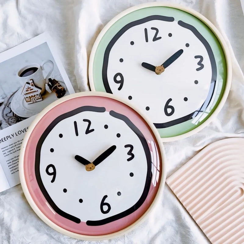
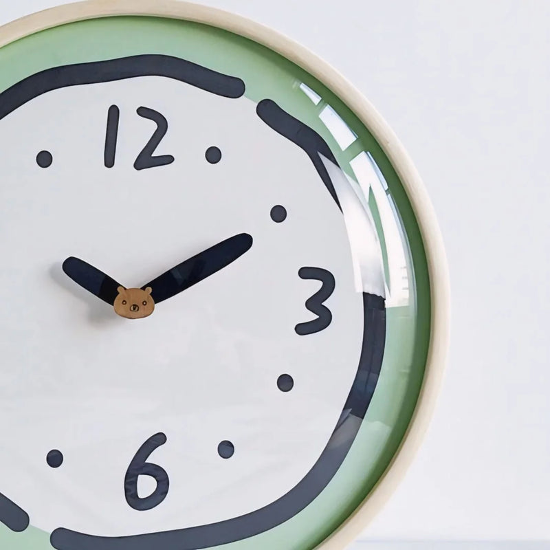
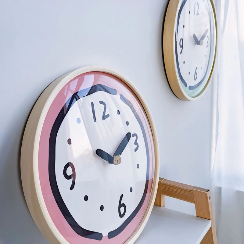

Why it works on a bare wall: at $59 it gives a blank rental wall a single point of character without a single nail-hole regret, and because it reads as functional first, nobody walking in registers it as "decoration." They just think the room feels alive.
Where the playful thing should actually live
Once the Keep-One Edit becomes second nature, the next question is placement, and this is where I will gently disagree with most dorm guides. They tell you to decorate the wall behind the bed, the showpiece wall, the one people see first. I would rather you put your one playful thing where you see it first.
The corner you actually live in, the desk you sit at, the shelf at eye level from your pillow, the sill you glance at while the kettle goes, that is where a cute object earns its rent. Decor that exists for visitors is a stage set. Decor positioned for your own daily eyeline is a room that takes care of you a little. On our sets we always frame the keep from the angle the person who lives there would actually have, not the angle that flatters the photo.

A small practical note from setting up a lot of these corners: give your keep a clear sightline and a calm backdrop. If the wall behind it is already busy, the object loses. If the surface under it is cluttered, the object loses. The playful thing wins by contrast, and contrast needs quiet to push against. For more cute pieces built to be a single confident keep rather than a pile, our Cute Aesthetic Room Decor collection is where I pull most of mine.
Cute you can sleep in, not just look at
Here is the part most decor letters skip. The most-used surface in any starter space is the bed, and the softest playful decision you make is often the one you are physically wrapped in, not the one on the shelf. Cute does not stop at objects. It runs straight through what you sleep in and on, and that is where the grown-up version of playful gets easiest, because texture carries the charm and you never risk the gift-shop look.
Bedding is the keep that takes up the whole room. We styled the polka dot set on a wooden frame next to a single solid-yellow pillow and a real orange someone had left on the duvet, and that almost-accident is exactly the energy I want: playful pattern, washed-soft texture, nothing trying too hard. The dots are small and irregular against the crinkled cotton, so it reads as character, not costume.
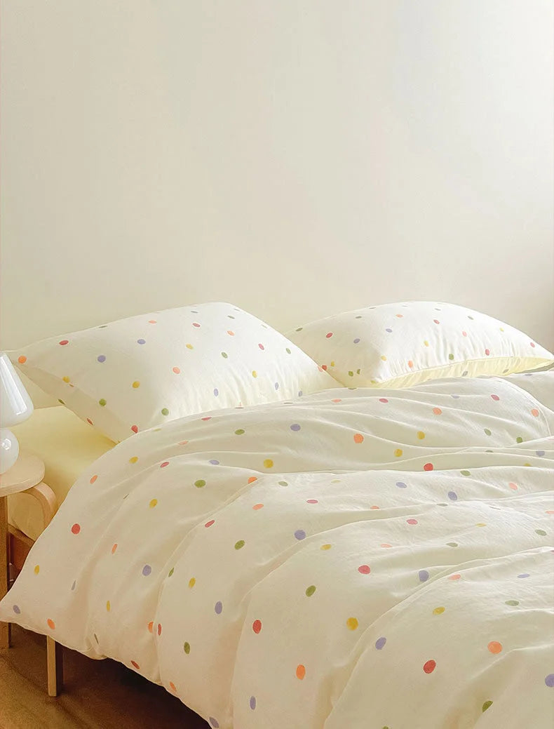
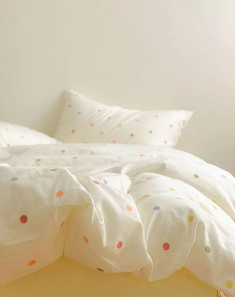

Why bedding is the smartest keep of all: at $139 it is one purchase that resets the entire mood of a room, and because the playfulness lives in soft, washed texture rather than a loud graphic, it stays cute long past the week you unpacked.
And then there is the version of cute nobody photographs but everybody lives in, what you wear to bed. I am only half joking when I say sleepwear is the truest test of a young, playful space, because it is the cute you choose when no one is grading the room. The ruffle-hem set in dusty rose is the one I keep recommending: the ruffle is the playful note, the soft cotton keeps it from reading childish, and it photographs as nicely as it lounges.



If your version of playful runs bolder, the pink-and-green striped fleece set is the loud-but-cozy keep, plush enough that the bold stripe reads warm instead of garish. And if you want the quietest playful of the three, the lavender contrast-trim set keeps the cuteness to a single line of piping. Three different volumes of the same idea, so you can match your sleepwear to how loud the rest of your room already is.

Soft Ruffle Hem Cotton Pajama Set

Soft Contrast Trim Cotton Pajama Set
Why sleepwear belongs in a decor letter at all: at $99 to $119 these are the playful pieces that touch you every single night, and a room that feels cute the moment you climb into bed is a room that is working for you, not for a photo.
Start with one corner
If you take one thing from this letter, let it be the smallest one: you do not build a cute room. You earn one corner at a time. Run the Keep-One Edit on a single surface tonight, the desk, the shelf, the sill you glance at most, and let exactly one playful thing be loud while everything else stays quiet. Tomorrow, the next surface. That is the whole method, and it never produces the gift-shop room because it never lets density win.
Cute, kept honest, is not a phase you grow out of. It is just personality that learned restraint. When you are ready to choose your first keep, this is where I would start looking.

Shop Cute Aesthetic Room Decor

Textured Colorful Polka Dot Washed Cotton Bedding Set
Written by the RoomDen styling desk. We style every product in our own daylight studio before it ships, which is why the advice here comes from sets we actually built, not a trend roundup. Last updated June 2026.


