
Danish Pastel Room Decor: A Dopamine-Bright Guide (2026)
Danish pastel only reads grown-up when one soft shade leads and the rest punctuate. We break the look into a simple color recipe, styled with pieces shot in our own studio.

Good danish pastel room decor is not the sugar-rush, candy-colored nursery the name keeps promising. We learned that the hard way the first afternoon we tried to style a corner in our Shenzhen daylight studio: we lined up six pieces in their happiest shades, stood back, and the whole vignette read like a dropped box of macarons. Too sweet to live with. The fix was not less color. It was a ratio. Danish pastel works the moment you stop treating every soft hue as equal and start letting one shade carry the room while the others punctuate it.
This is a guide to that ratio. We will walk through the color roles a pastel room actually needs, using pieces we have photographed, touched, and re-shot until the balance felt grown-up instead of toddler. Think of it less as a shopping list and more as a recipe you can run with whatever you already own.

Contents
The Sherbet Spine: a three-part color recipe
Every pastel room we have styled that actually held up over a week came down to the same proportion, so we gave it a name we keep using on shoot days: the Sherbet Spine. One scoop, one drip, one line of ink.
The scoop is your muted base, the soft shade that takes up the most surface area and asks for nothing. The drip is a single saturated punch, the one color allowed to shout. The ink is a darker grounding note, usually a graphite or near-black, that gives your eye somewhere to rest so the sweetness reads as deliberate rather than accidental. Roughly, we aim for a scoop that covers most of the room, a drip that shows up in one or two places, and a thin line of ink threaded through. Get that spine right and you can pile on as much color as you want; skip it and three pastels are already too many.
The rest of this guide is just the spine, role by role.
The Scoop: your muted base layer
Why the base should be the calmest thing in the room
The mistake we made in that first shoot was giving the loudest pieces the most space. A pastel room needs its largest surfaces, the bed, the curtains, the upholstery, to sit in the quietest version of color you can find: a washed cream, a chalky rose, a sleepy lavender. These are the scoop. They read as soft neutrals from across the room and only reveal their warmth up close. That restraint is what buys you permission to go bright everywhere else.
Soft cotton as the quietest pastel
So how do you make a base feel like color without it competing? Our answer on more than one shoot has been the Plush Solid Color Fleece Pajama Set, which we keep on set in Cream White, Dusty Rose, and Lavender. We fold the three tops together for a flat-lay and they behave exactly like a base should: each one is unmistakably a pastel, yet stacked side by side they barely raise their voices. That is the texture of a good scoop. When we draped the Dusty Rose top over an unmade bed under window light, it disappeared into soft-neutral territory until you walked right up to it.

Why it works as a scoop: the solid washes give you the soft hue with none of the visual chatter a print would add, so they anchor the spine without ever fighting the drip.


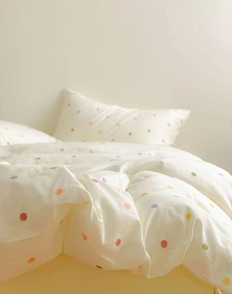
The same logic carries straight into the bed. A washed-cotton set in a quiet print does the heavy lifting of the scoop on your largest surface without flattening into a beige nothing.

Why it works as a scoop: the pale yellow ground and small scattered dots keep the energy low across a whole duvet, so the bed reads pastel-soft instead of pastel-loud, leaving room above it for one real punch.
The Drip: one saturated punch
A single glossy hit of color
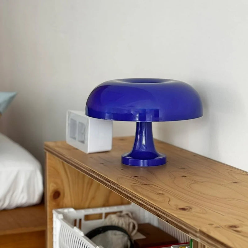
Here is the part everyone gets backwards. The thing that makes danish pastel feel dopamine-bright is not lots of bright; it is one bright, placed where the eye lands first. We call it the drip because it should feel like a single drop of saturated color falling into all that softness. On shoot days the piece that earns that role most often is the Retro Glossy Mushroom Accent Lamp. The cobalt blue is genuinely loud, almost too loud on its own, which is exactly why it works: against a scoop of cream and rose, that one glossy dome is the whole reason the corner feels alive.
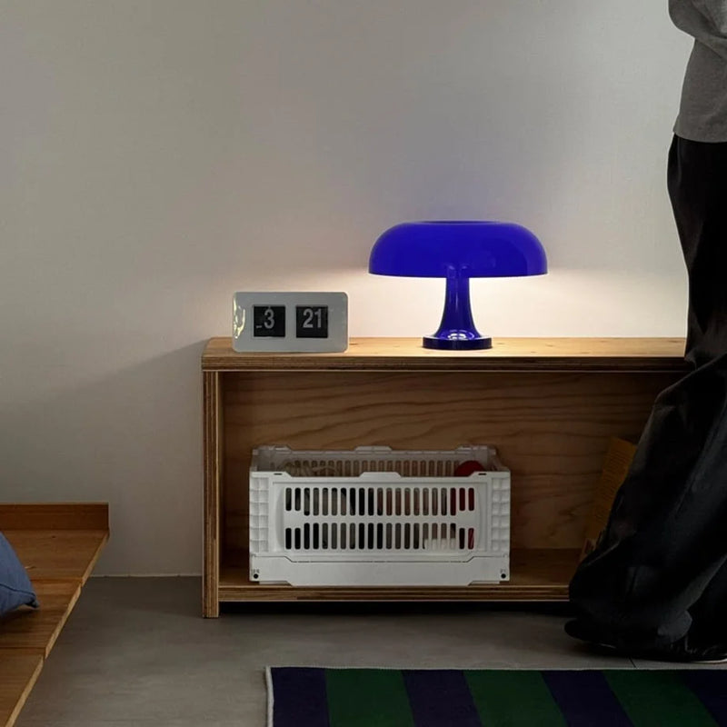
Why it works as a drip: the glossy finish bounces light, so a small object punches far above its size, which means one lamp can be your entire saturated quota for a room.
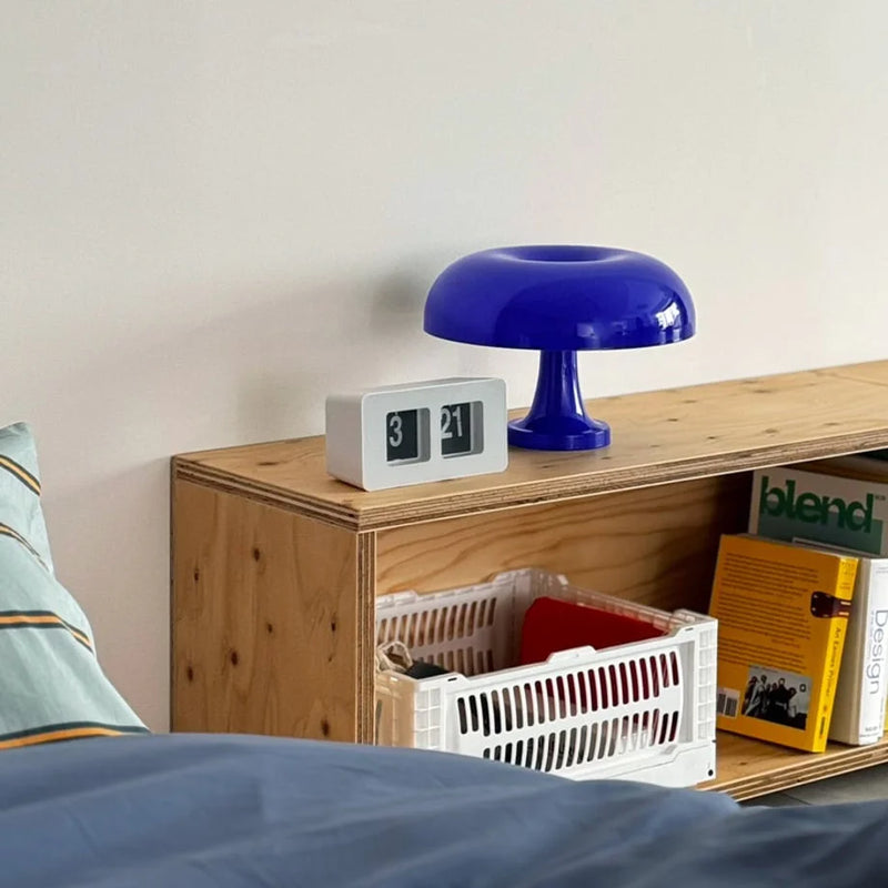
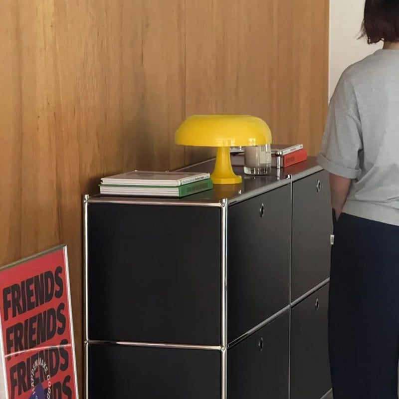
If cobalt feels like a lot for your space, the marigold colorway is a gentler drip that still carries the same job. The point is never which color. It is that there is exactly one, and it owns the spotlight.
Pattern as a controlled drip
A drip does not have to be a single object. Sometimes the punch is a pattern, as long as you let it be the only loud thing in its zone. The first time we styled the Textured Colorful Polka Dot Washed Cotton Bedding Set we made the rookie error of surrounding it with more print, and the bed turned into noise. Stripped back to a plain wall and one quiet lamp, the same dots became the cheerful focal point the room had been missing. That is pattern behaving like a drip: concentrated, framed by calm, allowed to be the star of its own surface.

The Ink: the grounding shade that buys you sweetness
This is the role nobody talks about, and it is the one that separates a room that looks designed from a room that looks like a toy aisle. The ink is a single darker thread, a graphite, a charcoal, a true near-black, run through an otherwise pastel scheme. It gives your eye a place to rest. Without it, all that softness floats with nothing to push against and the whole thing tips into saccharine.
Our favorite way to lay down ink is on the bed itself, because the bed is the biggest canvas you have. The Smooth Wavy Abstract Cotton Bedding Set runs a bold black-and-beige curve across the duvet, and we have used it specifically as the grounding layer under brighter accents. When we shot it beside the cobalt lamp, the black wave and the blue dome held each other in place; the room finally felt anchored rather than adrift in sweetness.

Why it works as ink: the graphic black curve is the one place your eye can settle, so every pastel around it suddenly reads as a choice instead of a default.


If a whole bed of ink feels heavy, you can scale the role down. A clock with a charcoal sketch, a black book spine, a single dark frame, anything that introduces that resting note in small doses, does the same grounding work.
Texture: the role that keeps pastel from going flat
Color gives you the spine. Texture is what keeps a pastel room from photographing like a flat swatch. This is the lesson danish pastel quietly borrows from its Scandinavian parent: soft does not mean smooth. We want hands-on warmth, the plush nap of fleece, the slubby crinkle of washed cotton, the matte-then-glossy jump between a fabric and a ceramic.
Loungewear is where we lean into this hardest, because it lets a pastel scheme spill off the bed and onto the person in it. The Plush Bold Striped Fleece Pajama Set in Pink & Green is our go-to when a vignette feels too pretty and not lived-in enough. The deep stripes and pink buttons add tactile contrast you can almost feel through the screen, and on a quiet Sunday-morning set it turned a styled bed into somewhere a real person had just been.

Why it works for texture: the plush nap and bold stripe bring touch and movement into the frame, so the softness reads as cozy and human rather than as a glossy showroom set.
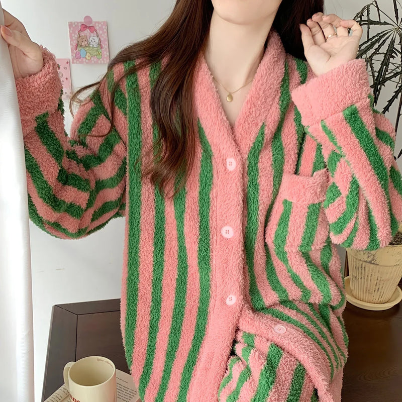
Notice what that row of three is doing: plush fleece, crinkled cotton, glossy ceramic. Three textures, one soft palette. That contrast is the difference between a pastel room you want to touch and one that looks like a phone wallpaper.
Reading the ratio on yourself
Once the spine clicks, you start spotting it everywhere, even in the smaller pieces. The Whimsical Doodle Style Wall Clock is a tidy example of the whole recipe shrunk onto one object: a soft pastel face (the scoop), a single bright doodle (the drip), and a little dark sketched character on the hands (the ink). We hung the pink and green pair on a pale grey wall during one shoot and they read as cheerful rather than childish precisely because each color was doing a defined job, not just being colorful.
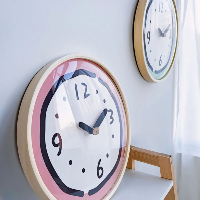
Why it works as a test piece: the clock carries scoop, drip, and ink on a single small face, so it is the cheapest way to see whether you actually like the ratio before you commit it to a whole bed.

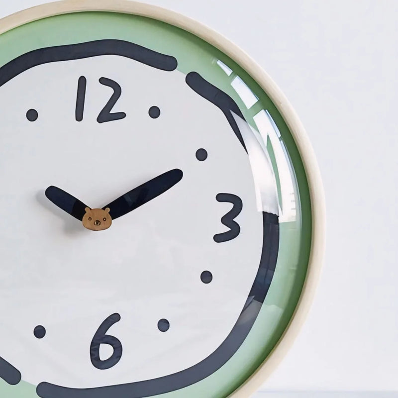
The deeper point, and the thing the Scandinavian roots of this trend keep insisting on, is restraint. If you want the design history behind why danish pastel reads as joyful rather than juvenile, Better Homes & Gardens has a clear primer on how the look grew out of muted Scandinavian palettes. The takeaway lines up with the spine: the color only sings when something quiet is holding it.
Start with one corner
You do not need to repaint a room or buy a new bed to test the Sherbet Spine. Pick one corner. Lay down a soft scoop, add a single bright drip, thread in one line of ink, and let texture do the rest. If that small frame holds together, you have your ratio, and you can scale it to the whole room with confidence.
When you are ready to build the palette out, our Danish Pastel Aesthetic Room Decor collection is where the scoops, drips, and ink we shoot for these guides actually live, so you can mix the roles the same way we do on set.

Retro Glossy Mushroom Accent Lamp
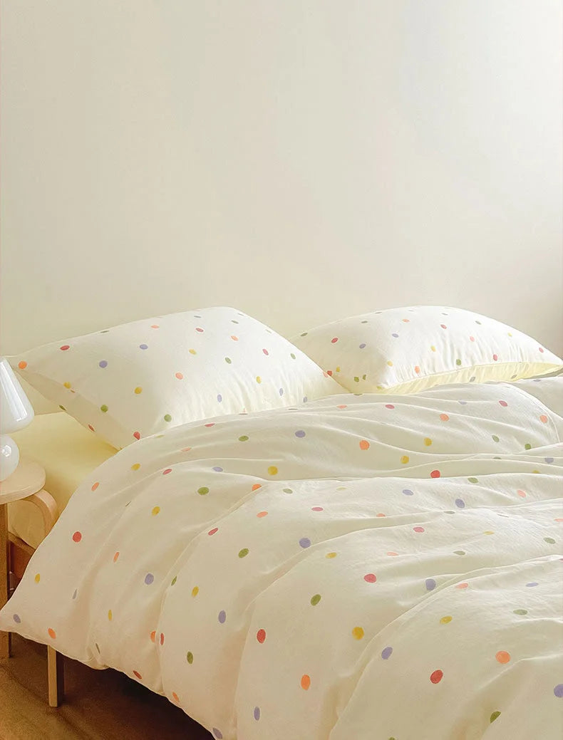
Textured Colorful Polka Dot Washed Cotton Bedding Set
Written by the RoomDen styling desk. We style every product in our own daylight studio before it ships, and we re-shot the corners in this guide more than once to get the ratio right. Last updated June 2026.


