
Sage Green Bedroom Decor: An Earthy, Grounded Guide (2026)
Sage is the easiest green to get wrong. This guide walks through why yours turns grey, grim, or military — and the small, warm, low-stakes swaps that pull it back to an earthy, grounded...

The question we get more than any other about sage green bedroom decor isn't "where do I start" — it's "why does mine look wrong?" Someone falls for a dreamy sage moodboard, buys the paint and the linen, and ends up with a room that reads hospital corridor, army surplus, or just sad dishwater grey. Sage is one of the easiest greens to botch, and the failures are weirdly consistent. So this guide is built backwards: not a parade of pretty ideas, but the specific ways sage goes south, and the small, low-stakes swaps that pull it back to the warm, grounded, slightly-imperfect green you actually wanted.
We sell sage as a whole aesthetic, which means we've spent a lot of hours in our daylight studio watching it behave (and misbehave) next to real textiles. Almost everything below comes from that: which sage pieces our customers keep, which greens flatten under warm bulbs, and the exact moments a room tips from "earthy" to "off."

Contents
Why your sage keeps turning grey, grim, or military
Sage is a muted, grey-leaning green, and that grey is exactly what makes it fragile. Push the grey too far and you land on dishwater. Pull the warmth out and add depth and you slide toward olive, then army. Drop it under a cool LED bulb and the whole thing goes flat and clinical. The color that looked so calm on a screen is, in a real bedroom, sitting in real light next to real fabric — and that's where it gets opinionated.
Three failure modes cover almost every "my sage looks wrong" message we see. The grey-out: a sage so desaturated it reads as a slightly tired neutral, no life in it. The military drift: a sage gone deep and yellow-green until it feels like a uniform, not a bedroom. And the cold-clinic: a perfectly nice sage murdered by cool-white bulbs and zero warm texture, so it photographs like a waiting room. None of these are "bad sage." They're sage with no warm counterweight and no texture to soften the flatness.
The real cost of getting the green wrong
Here's why this matters more for sage than for, say, a bold terracotta or a navy. With a saturated color, a near-miss still reads as "that color, a bit off." With sage, a near-miss reads as a different mood entirely — restful becomes dreary, grounded becomes drab. The room doesn't fail loudly; it just quietly never feels good, and you can't put your finger on why. So you keep adding more green to fix it, which is the second cost.
The over-correction trap is real: the green looks weak, so you double down (green walls, green bedding, green art, green everything) and now the room is monochrome and airless, the opposite of the calm you were chasing. The fix is almost never more green. It's a warm counterweight (a rust, a cream, a wood tone) and a shift from "painting the room sage" to "letting a few honest sage textiles carry it." We styled an entire shoot around exactly that idea, and the green only started looking expensive once we stopped flooding the frame with it.
Anchor the room to one honest sage first
Before a wall color, before bedding, find one sage piece you trust and let it set the temperature for everything else. A textile is the safest anchor because you can hold it in your own light and see, in two seconds, whether your room flatters that green or fights it. Get this reference right and the rest of the palette falls in behind it.
Lead with a textile, not a wall
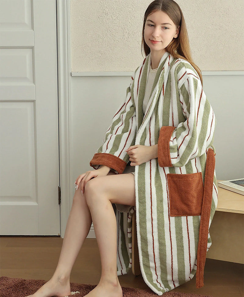
How do you judge a sage before you commit a whole room to it? You put it next to your skin in your actual bedroom light. A robe is a sneakily good test object — it's a big, soft field of the exact green, it moves through morning and evening light with you, and it forgives a slightly-off wall in a way that painted drywall never will.
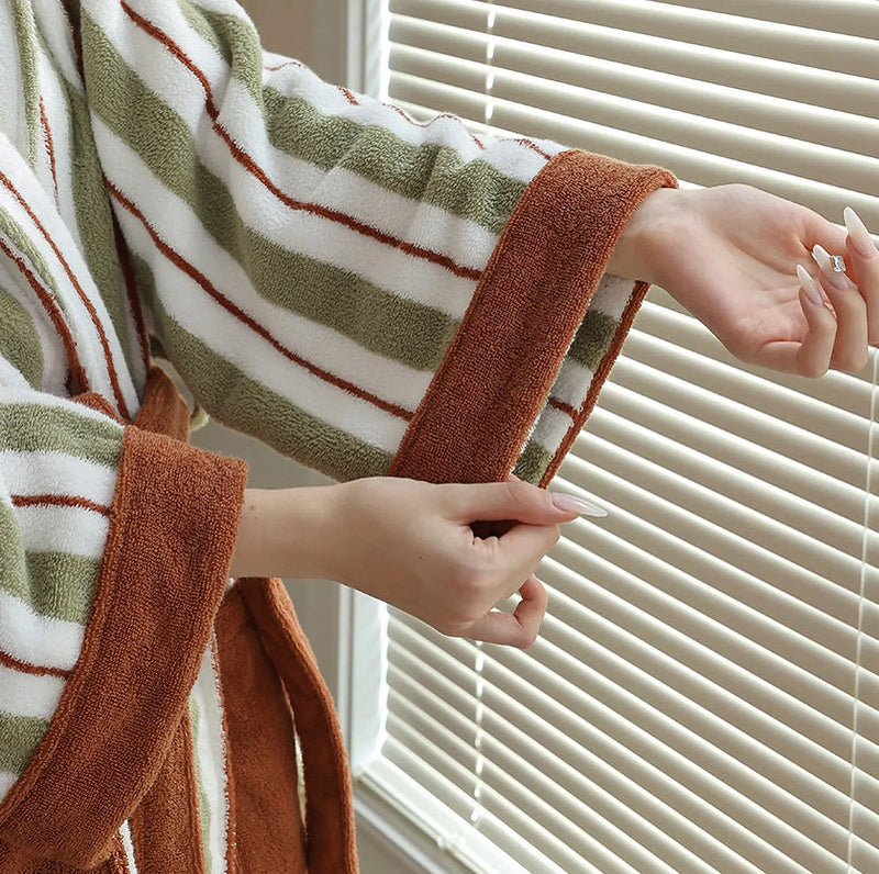
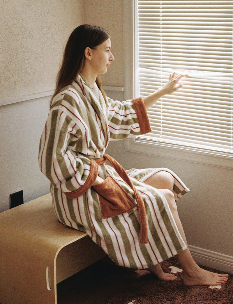
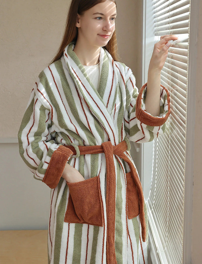
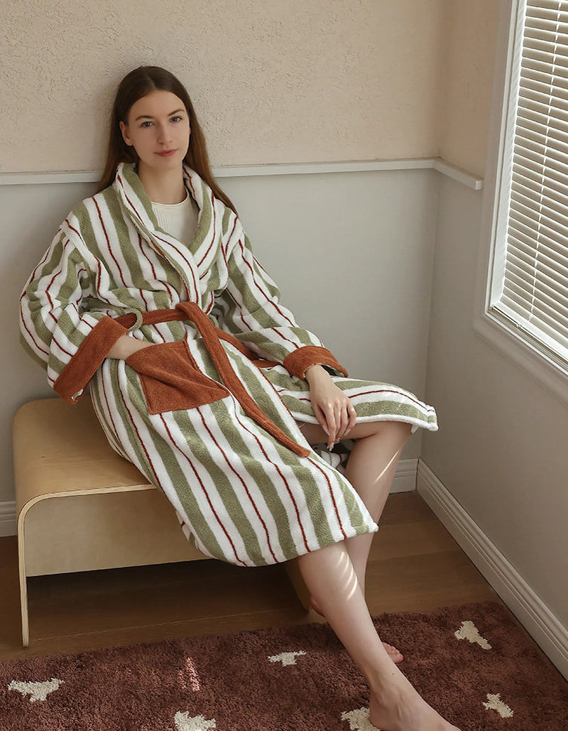
This is the piece we reach for first when we want to show people "the right sage." The stripe keeps the green from going flat, so it reads as a considered, slightly vintage sage rather than a paint chip, and the rust cuff does the warm-counterweight job built in. In our own daylight studio we sat it against three different off-whites before a shoot; against the coolest one the sage went grey and joyless, against a warm oatmeal it came alive, and that single comparison decided the whole set's background. Hold this green up in your room and you'll get the same verdict in about ten seconds.
Let a warm thread keep it earthy
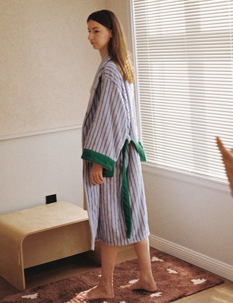
What's the one move that pulls sage back from "cold" every single time? A warm thread running through it (rust, blue-with-green, a touch of orange) so the green never sits alone looking clinical. The most common grey-out fix isn't warming the bulbs, though do that too; it's choosing sage pieces that already carry their own warmth instead of asking the lighting to rescue a pure, cold green.

This blue-striped version is the sleeper move for a sage bedroom that's tipping cold: the green lives in the cuffs and waist tie, so it reads as an accent against a calm blue field rather than another wall of sage. We keep both robes in the same shoots because they answer different rooms. The sage-led one is for spaces that need the green to lead; the blue-led one is for spaces already drowning in green that need it dialed back to a trim detail. If your room is in the over-correction trap from section two, this is the gentler green.

Build outward in the soft layer
With a reference green chosen, the rest of the bedroom is just supporting cast, and crucially, it lives in the soft, swappable layer where mistakes are cheap to undo. This is the part of sage green aesthetic room decor that does the real work: towels, slippers, a little art, the things you can return or move that the paint can't. Get these warm and textured and the green looks intentional, even if your wall is a hair off.
Underfoot, where mistakes hide
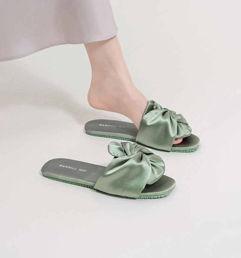
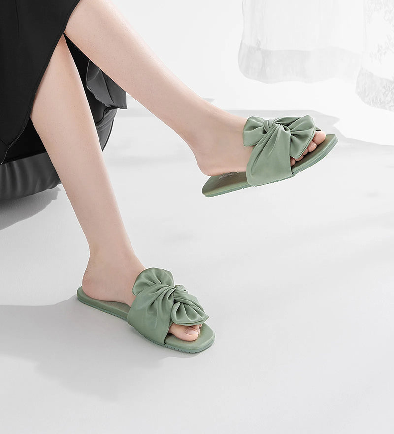
Why fuss over slippers in a decor guide? Because the floor is where a sage room quietly fails. Bare feet on cold flooring under cool light is the exact recipe for "clinical," and a soft sage object at floor level is the cheapest way to break it. It's also the lowest-stakes place to test the green: if a small sage piece looks good by your bed, a bigger commitment will too.

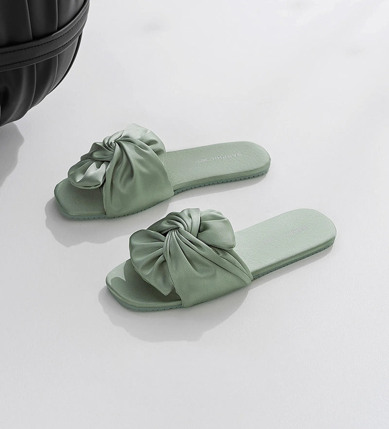
The sateen sheen here is doing something specific: a matte sage at floor level can read dull, but the slight luster catches warm light and keeps the green alive instead of letting it sink into the rug. The ruched bow adds a soft, unserious detail that pulls the whole room away from "spa" toward "lived-in." When we shot these in sage we noticed the green only photographed well once a warm bulb was overhead; under our cooler fill light the same slipper went grey, which is the single best argument in this guide for warm bedside lighting.
Want sage at floor level without going head-to-toe green? A gingham slipper is the soft-and-warm version: the green sits inside a homespun check next to brown and red, so it reads as cozy pattern rather than a solid block of color trying to match your wall.

The green gingham is our pick when a sage room is reading too cool and grown-up; the warm brown in the weave does the counterweight work, and the check breaks up flat color so the green never feels like a swatch. It's a small thing, but small warm things at floor level are exactly what rescue a sage scheme from the cold-clinic trap.
On the wall, without the green pile-up
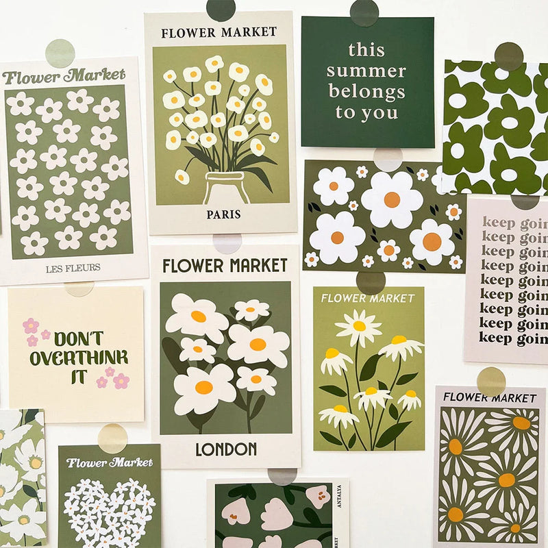
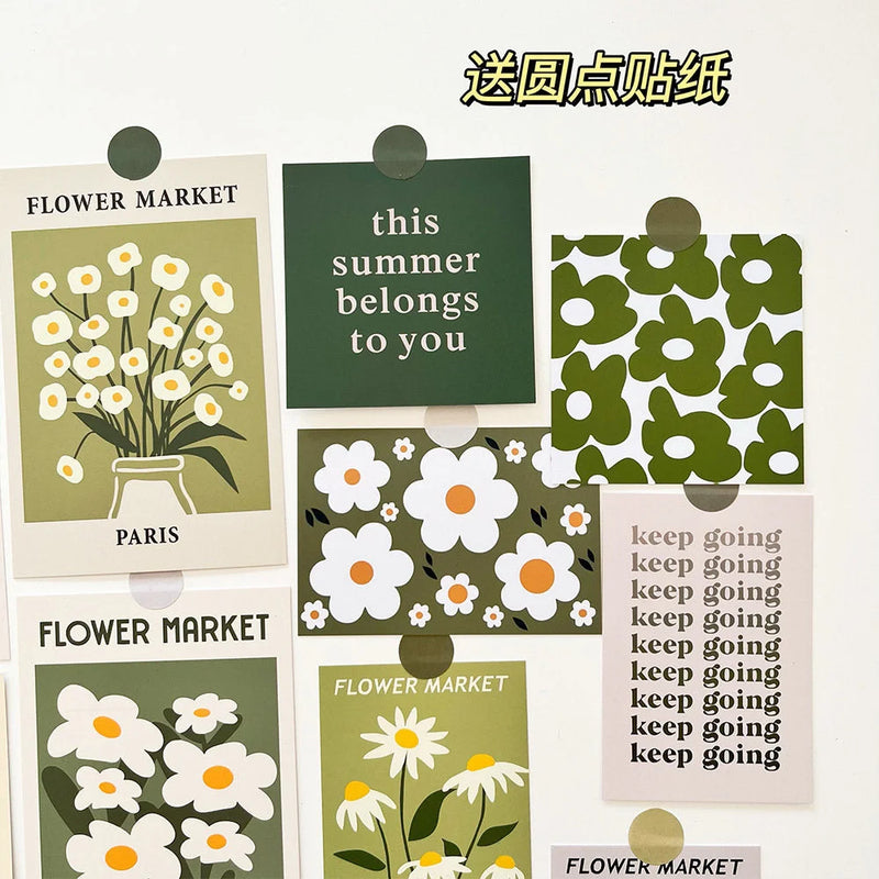
Walls are where the over-correction trap usually lives: paint the wall sage, hang sage art on it, and the green stacks into a flat sheet. The safer move for the eye-level layer is sage as botanical motif, on a clean ground, so the green has air around it instead of more green. How do you bring sage up the wall without sealing the room in it? Let white space do half the work.

The matte cardstock matters here: a glossy print would bounce light and read cheap, while the flat finish keeps the sage soft and a little hand-printed, in line with the slightly imperfect, unfussy look the whole aesthetic is after. Because each piece sits on white, the green stays a motif instead of a mass, which is the single best antidote to the monochrome-airless problem. Cluster a few over a bedside table and you get the green up at eye level without committing a whole wall to paint you might regret.
When sage isn't your only green
One last pitfall: thinking "sage bedroom" means every green object must be the same sage. The rooms that actually feel earthy let a few greens coexist (a truer green stripe, a deeper green trim) as long as they share a temperature and a warm anchor. The mistake isn't mixing greens; it's mixing a warm sage with a cold green and wondering why the room feels jittery.
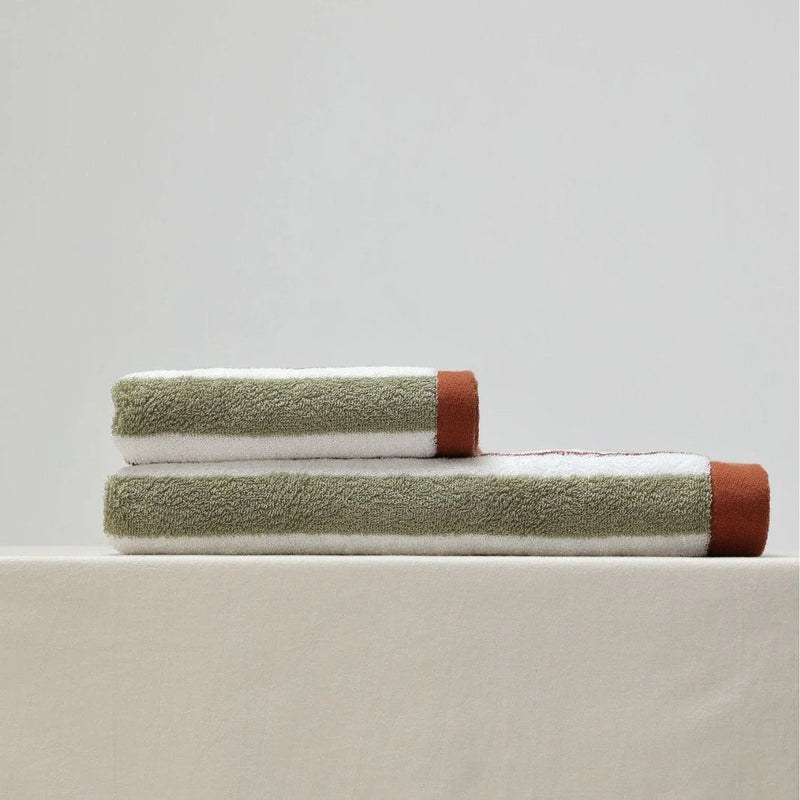
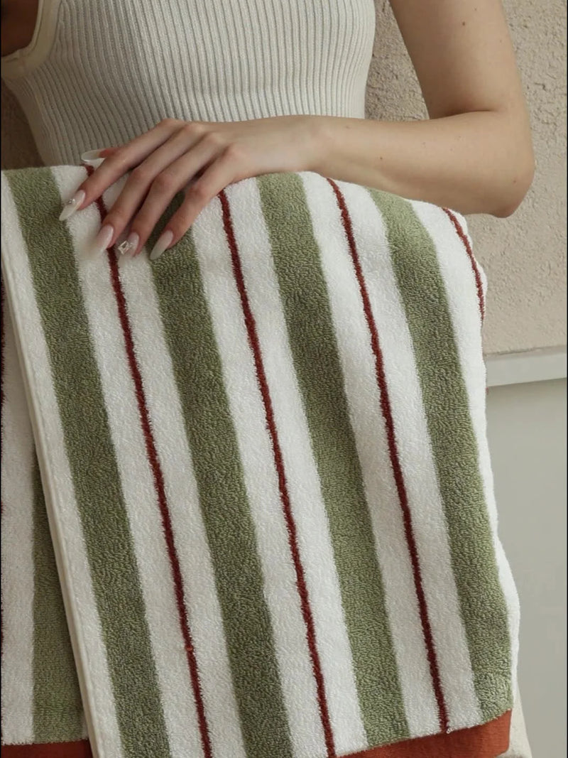
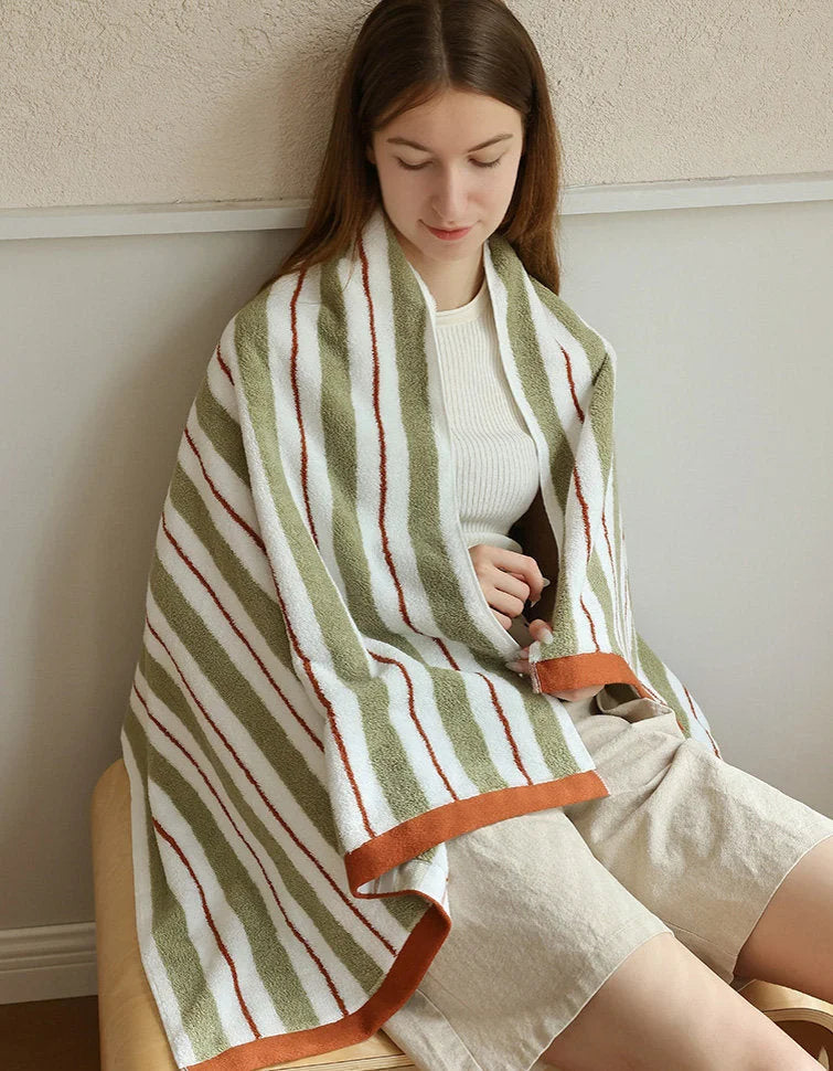
An easy place to test this is the bath-adjacent layer of the bedroom, where a towel can carry a brighter, fresher green that still belongs because the cream and the warm stripe tie it back. The green here is livelier than the robe's muted sage, but they read as cousins, not strangers.

The orange thread in this stripe is the whole reason it works next to sage: it's the warm counterweight again, just woven in rather than added. We fold these on an open shelf in sage shoots precisely because the brighter green plus the orange keeps the corner from going too quiet and grey. If your sage room feels a touch lifeless, a fresher green with a warm stripe is a low-cost jolt that won't break the palette.
If you want a deeper read on how warm neutrals carry a green-leaning palette, the color team at Pantone's color intelligence library is a solid, non-promotional place to see how muted greens are paired in practice.
Start with one corner
You don't fix a sage bedroom by repainting it. You fix it by getting one honest sage textile into your real light, giving it a warm thread to lean on, and letting the soft, swappable layer carry the green so a slightly-off wall never gets a vote. Start with one corner (a robe over a chair, a slipper by the bed, a small cluster of botanical prints) and judge it under a warm bulb before you commit to anything you can't return.
Everything we styled this around lives in one place if you want to see the greens side by side and pick your reference first. Build out from there, slowly, and the room stays earthy instead of going grey on you.
Plush Sage Striped Long-Staple Cotton Robe
Shop Sage Green Aesthetic Room Decor
Styled and written by the RoomDen styling desk. We style every product in our own daylight studio before it goes live, and these notes come straight off those shoots. Last updated June 2026.


