
Wabi-Sabi Bedding: Lived-In Layers for Deeper Rest
A hands-on guide to picking washed cotton and linen sets whose creases read settled, not snagged, with six RoomDen sets styled to look like deep rest instead of an unmade bed.

Good wabi sabi bedding lives or dies on one tactile question: when you drag your palm across the duvet, does the crease feel settled or does it feel snagged? Settled is the soft, slow fold that washed cotton makes when it has been slept in and loved. Snagged is the sharp, tense pucker that reads as "I forgot to iron this." Same wrinkled fabric, two completely different stories. One says lived-in; the other says unwashed laundry. This whole guide is about closing the gap between those two, because that gap is the only thing standing between you and a bed that looks like deep rest instead of a chore you skipped.
We make this call every single shoot. Our styling desk handles a lot of crinkled cotton, and we have learned that "wabi-sabi" is not a license to leave the bed a mess. It is a discipline about which imperfections you keep. So we built a small test for it, and we are going to walk you through it one layer at a time, using six real sets from our own catalog as the working examples.

Contents
The Settled-Crease Read
Here is the test we run, and it takes about three seconds. Lay your palm flat on the top of the duvet and slowly draw it toward you. Do not look; feel. A settled crease gives way under your hand; the fabric folds soft and slow, the ridges are rounded, and your palm glides without catching. A snagged crease fights back; the ridge is sharp, the fold is tense, and your hand stutters over a little crisp peak. That is the whole framework. We call it the Settled-Crease Read, and once you have felt the difference a few times you cannot un-feel it.
It matters because wabi-sabi rests entirely on intentional imperfection. A settled crease is the imperfection you keep: the softness, the slept-in honesty, the Ma of an unmade-but-cared-for bed. A snagged crease is the imperfection you fix, because it reads as neglect, not as rest. Every section below is just one layer of what makes a fabric settle instead of snag: the weave, the edge, the color, and finally how you make the bed. Get those four right and the crinkle stops being a liability and starts being the entire point.
Why most washed cotton reads messy, not restful
The honest problem first: most washed-cotton bedding photographs beautifully flat and disappoints the moment a real person sleeps in it. The wrinkle that looked artful in the listing turns into a flat, crushed plain of fabric by Tuesday. Why? Because a smooth-faced cotton has nothing to break the wrinkle up, so the crease falls in one long, hard line, and one long hard line always reads as a mistake. The fix is not better ironing. It is choosing a fabric whose surface already does the work of softening the fold before you ever touch it.
The weave decides whether a wrinkle looks intentional
So what do you do when a flat-faced washed cotton keeps reading as "crushed" instead of "calm"? You give the surface its own texture, so the crease has company. A subtly raised geometric face scatters the light across dozens of tiny ridges, and a long hard wrinkle physically cannot form. The fold breaks into a soft field instead of a single tense line. That is exactly why we keep reaching for the crinkled geometric set when a bed needs to look rested under flat daylight.
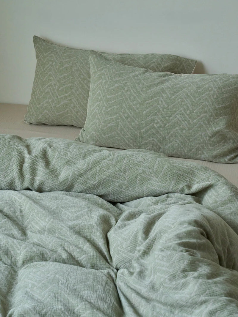
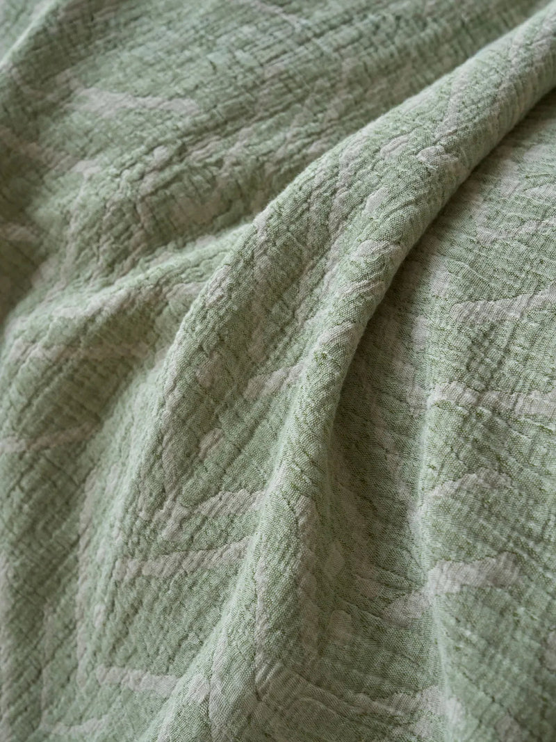
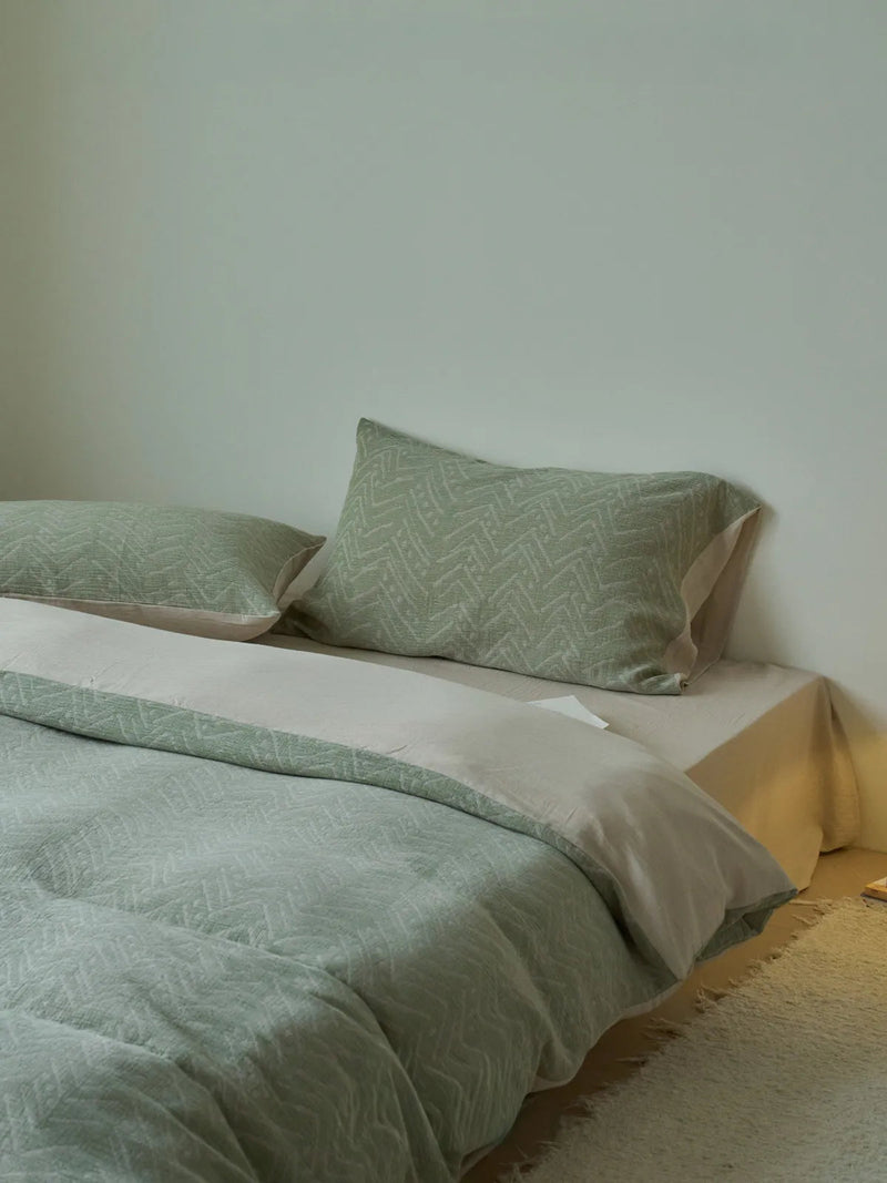
Why it works: the raised geometric face passes the Settled-Crease Read before you even style it. We shot this one in sage in our own daylight studio and tried to make it look messy on purpose — flung the duvet back, no smoothing, and it simply refused to read as careless. The texture caught the light in a dozen places and the eye never found a single hard line to object to. That is the whole trick: a surface that is already a little restless makes a real wrinkle look like part of the plan.
A close cousin: woven stripe that holds its shape
But what if you want the wrinkle to read as relaxed without going fully tonal, with some structure, some line still in play? A woven stripe does the same softening job as the geometric face, except the stripe also gives the eye a grid to rest on, so even a slack, mid-day bed looks composed rather than collapsed. The stripe is a built-in alignment cue; your eye reads "made" even when the duvet is barely tugged into place.

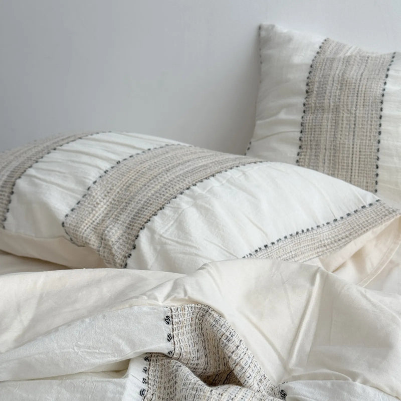
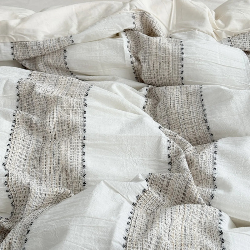
Why it works: the oatmeal stripe is the most forgiving set we own for people who confess they will never make the bed properly. The vertical line does the tidying your hands skip. We left this one half-pulled on a side table for a casual flat-lay and it still photographed as "kept," because the stripe carried the order the styling did not.
The edge is where the eye decides "kept"
Now to the layer almost everyone misses. You can nail the weave and still have a bed that looks abandoned, because the eye does not judge a made bed by its middle. It judges by the edge. A raw, untreated hem says "thrown together." A defined, intentional edge (embroidery, a ruffle, a contrast trim) tells the brain "someone cared about this," and that single signal lets you get away with a much messier center. The edge is the period at the end of the sentence; without it the whole bed reads unfinished.
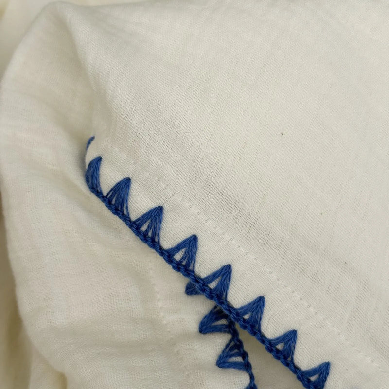
Take the embroidered-edge set. The body is a soft crinkled cream that would, on its own, sit right on the line between lived-in and limp. But the slim embroidered trim runs the whole perimeter like a drawn line, and suddenly the soft middle reads as a deliberate choice framed by a careful edge. We default to this one whenever a guest room needs to look hosted rather than just occupied.

Why it works: the embroidered line is a tidiness cue your hands never have to earn. We styled this against a pale blue sheet in the studio and noticed the trim photographed sharp even when the duvet behind it was deliberately rumpled. The eye locked onto the crisp edge and forgave everything inside it.
A ruffle that reads handmade, not unmade
So what about the bed that needs softness and personality, the one where a single embroidered line feels too quiet? A scalloped ruffle pushes the edge from "tidy" all the way to "handmade." Linen ruffles are the rare case where more texture reads as more intentional, not less, because a ruffle is obviously a made thing. Nobody accidentally ruffles a sheet. The frill becomes proof of craft, and proof of craft is exactly what wabi-sabi is chasing.

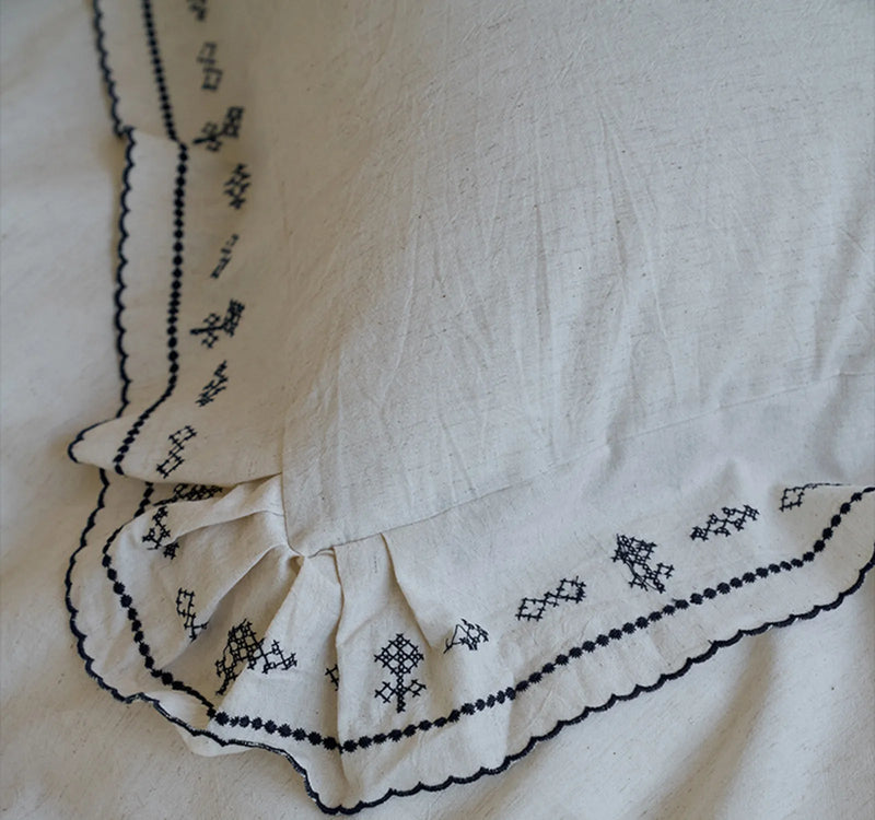
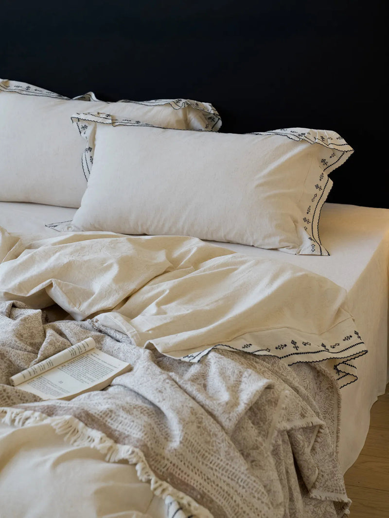
Why it works: linen wrinkles harder than cotton, so a ruffle is the safety net. It pre-loads the bed with so much obvious intent that the linen's deep creasing reads as part of the texture rather than a flaw. We shot it against a black headboard and the ruffle held its scallop even after the duvet had been sat on twice between frames. That resilience is the whole reason we trust it for beds that get actually used.
A vine print that hides the in-between
And if you want the edge-effect spread across the whole surface instead of just the border? A small, scattered print does that. A dainty vine breaks the field into a hundred tiny visual events, so the eye is busy reading pattern and never settles long enough to register a wrinkle as a wrinkle. Print is camouflage for the in-between days — the mornings you genuinely did not have time to smooth anything.

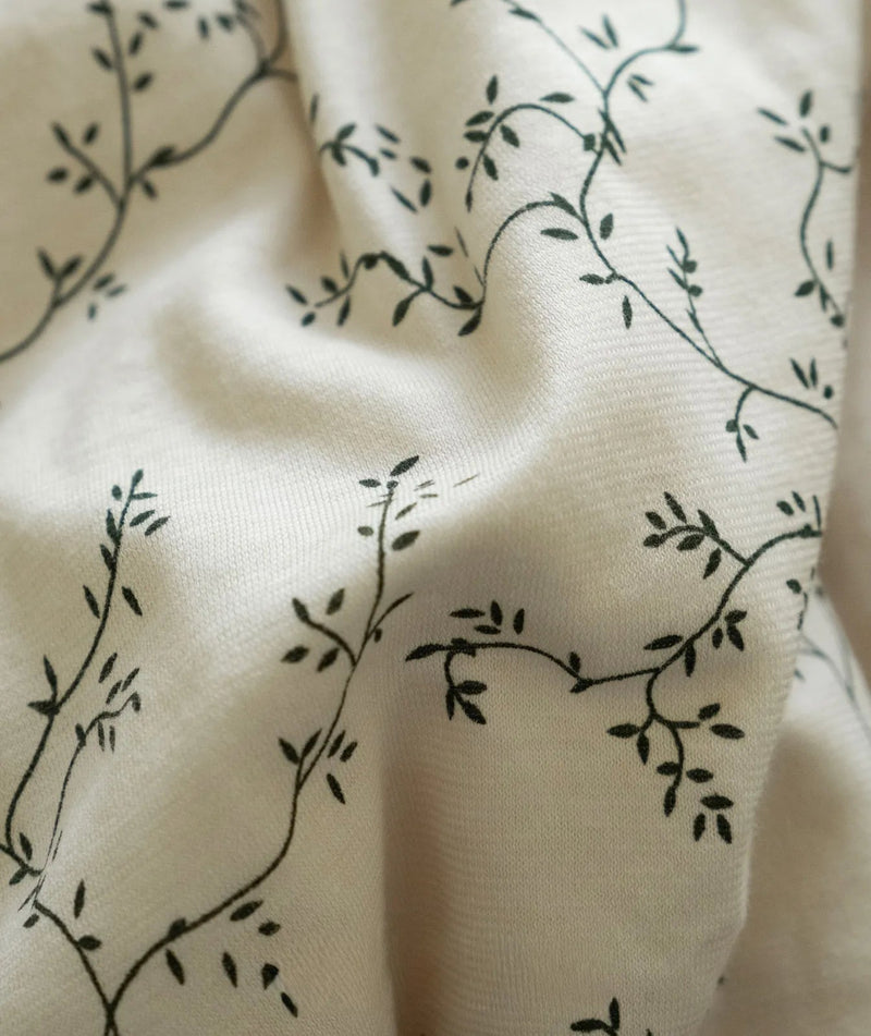
Why it works: the vine is so fine that from three feet away you read "softly patterned," and the actual creases vanish into the print. We put this one in a tight corner shoot with a crate nightstand, made the bed in under a minute, and the pattern absorbed every shortcut. It is the set we hand to anyone who wants the wabi-sabi look without the daily styling tax.
Color depth: the quiet trick for hiding a bad wrinkle
Here is the layer that surprises people. Two identical fabrics, one in a pale wash and one in a deeper tone, will read completely differently when wrinkled, because shadow is what makes a crease visible, and a deeper, warmer color simply has less contrast between its lit faces and its shadowed folds. A latte brown swallows a wrinkle that a bright white would broadcast across the room. If your bed gets harsh side light, or you know you are a chronic non-smoother, color depth is the cheapest insurance you can buy.



Why it works: latte brown is forgiving in a way white never is. We have shot the same set styled identically in both ends of our color range, and under the same studio light the brown's creases read soft while the paler creases read sharp — the warm tone just absorbs the shadow that gives a wrinkle its hard edge. Pair the pinstripe's quiet line with that depth and you have a bed that looks rested in almost any light.
One honest caveat we will not pretend away: a deep tone hides a wrinkle, but it also shows lint and pet hair more than a pale wash does. There is no free lunch in textiles; you are choosing which small imperfection you would rather manage. We think a shadow-eating crease beats a stark one, but your floor and your cat may vote differently.
The settle: how we style a crinkled bed to rest
Fabric choice gets you most of the way; the last stretch is in your hands, literally. "The settle" is the thirty seconds of styling that turns a snagged bed into a settled one, and it is the same routine we run before every shoot. None of it is ironing.

First, shake before you smooth. Grab the duvet at two corners, lift, and let it fall. This drops the fabric into its own natural folds instead of the tense lines your hands press in. Second, smooth from the center outward with an open palm, never a karate-chop edge; you are coaxing the crease to lie down, not creating a crisp hotel hospital corner that fights the wabi-sabi mood. Third, leave one corner of the top sheet honestly turned back. A bed that is too resolved stops reading as restful and starts reading as staged — the slight asymmetry is the Ma, the breathing room that signals a real person sleeps here.
Run the Settled-Crease Read one last time after you style. Palm flat, draw it toward you. If it glides, you are done. If it still stutters on a sharp ridge, give that spot a single open-palm pass and move on. The goal was never a perfect bed — it was a bed whose imperfections all read as kept rather than skipped. If you want to see all of these textures in one place, our washed cotton bedding collection is where every set above lives, and it is the easiest way to compare crinkle against crinkle. For the broader picture — pillows, throws, and the layers that frame the bed — the full bedding collection is the pillar we build these lived-in beds from.
Start with one set
You do not need to re-do the whole bedroom to get this. Pick the single set that solves your version of the problem: the geometric or stripe if your fabric keeps reading crushed, the embroidered or ruffle edge if your bed looks unfinished, the vine print or latte brown if you simply will never smooth anything and want the fabric to cover for you. Buy one, run the Settled-Crease Read for a week, and let your hand teach you the difference. The rest of the bed will follow once you have felt what "settled" actually means.

Soft Crinkled Geometric Washed Cotton Bedding Set
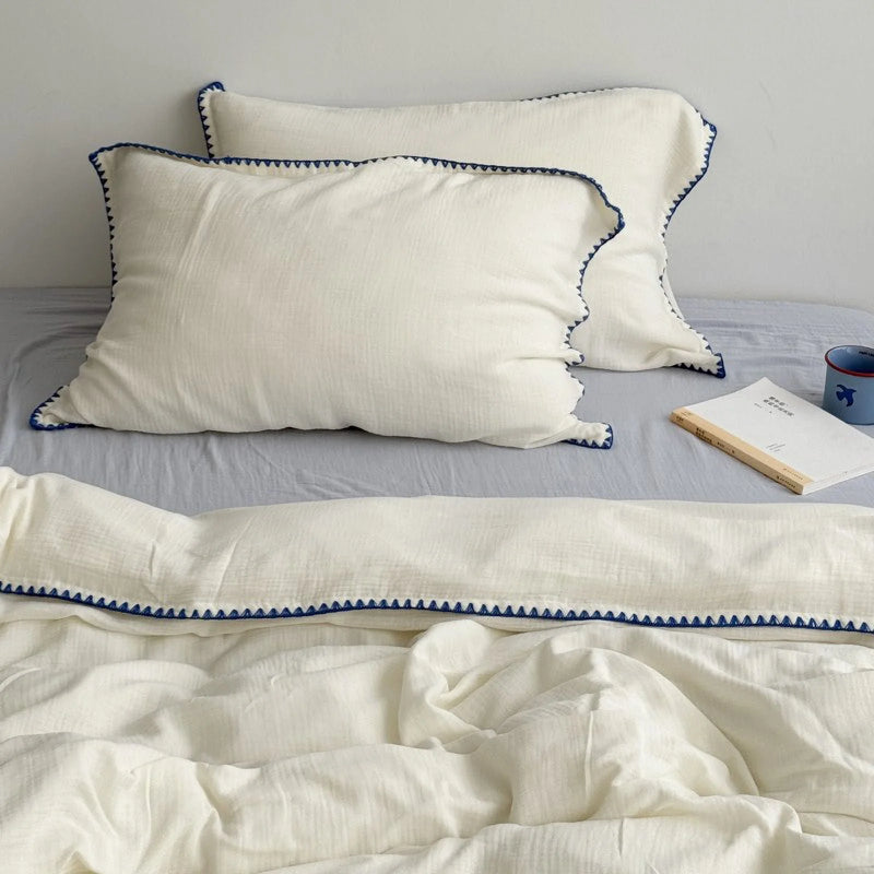
Textured Embroidered Edge Washed Cotton Bedding Set
Written by the RoomDen styling desk — we style and shoot every set in our own daylight studio before it ever reaches a bed at home, and the Settled-Crease Read is the first test each one has to pass. Last updated June 2026.


